
Beyond BI: Interactive Data Applications with Databricks and Plotly Dash

The Shift from Passive Reporting to Active Data Apps
Traditionally, data platforms based on Databricks or Snowflake were designed for a one-way flow: data moves from sources to a warehouse, and then to a BI tool for visualization and analysis. In most cases, the development process involves business users providing requirements, a Business Analyst translating those into technical specifications, and a team of Data Engineers building the solution. While agile methodologies are often used to bridge these gaps, this structure can struggle with more sophisticated needs.
Over the last decade, business teams have become more technical and interactive, and the need for fast changes in data analysis and processing has increased. As a result, we have identified a shift toward using Data Applications instead of traditional reporting. We use Plotly Dash for parameterized data delivery solutions. However, such a development also triggers significant concerns:
- What happens when a business user needs to do more than just view data?
- What if they need to trigger a complex recalculation, run a simulation, or generate a custom data mart on the fly?
- How can we integrate «power users» – those with both deep business and technical expertise – directly into the development process, rather than relying on a single Business Analyst?
In this post, we explore a framework for using Databricks as a powerful backend for Plotly Dash as a web-based application. This setup, created by an interdisciplinary team of technical and business experts, enables a seamless bridge between high-level business logic and scalable data processing.
The Frontend: Plotly Dash & Databricks Connect
While Databricks notebooks and pipelines are the standard for data processing, we identified a powerful way to build standalone Python applications that interact directly with Databricks resources. To make data truly actionable, you need a responsive interface. Plotly Dash provides this by offering a Python-based framework to build analytical web applications without requiring deep JavaScript knowledge.
The key enabler here is Spark Connect. It decouples the client (the Dash app) from the Spark server (Databricks), allowing the application to managing local workloads inside the app and managing workloads in combination with the backend in Databricks.
Trigger Interactive Processing
We can run complex Spark jobs on a remote cluster directly from a UI component. When working interactively with data that has intermediate results stored during processing, it is crucial not to wait for background batch jobs. From this perspective, Databricks Connect makes it possible to process data directly from a UI. The processes run on a Databricks cluster with direct reads and writes to Databricks tables:
spark = DatabricksSession.builder.remote(
host="https://adb-xxxx.x.azuredatabricks.net",
token="your-access-token",
cluster_id="xxxx-xxxxxx-xxxxxx" ).getOrCreate()

pdf_info_version = spark.read.table(info_table).toPandas()
We can receive information on actual data from a Databricks table directly in the frontend. Usability benefits for these use cases include:
- Combining heavy, data-intensive workloads completely within Databricks.
- Working on small datasets and user-managed parametrizations directly in the app.
- Providing process management capabilities to review analytics and directly trigger parametrized workloads.
In Fig. 1, we present an example app for manual configuration processing built with a Dash UI. It shows an overview of all Databricks job runs, along with additional tabs for data approvals and configuration settings. Depending on the project, it is possible to combine both: manual, parametrized jobs on the one hand, and scheduled, automated Databricks jobs on the other.
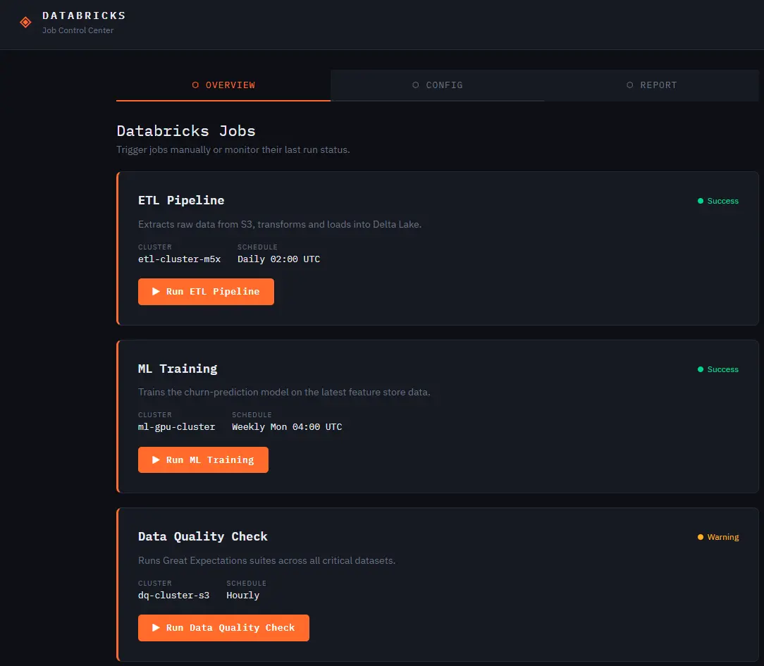
Triggering Workloads: From the Dash UI, users can adjust parameters and trigger Spark jobs that execute in the Databricks backend in real time (Figure 1).
Bridge the Gap: Transition seamlessly from automated job runs in a notebook to a productive web app using the same Python ecosystem.
Semi-Automation: This creates a «human-in-the-loop» system where the frontend collects user input and the backend handles the heavy lifting. Data quality and manual inputs can be managed by the user directly in the frontend.
Data Reporting Configuration in Plotly Dash
To handle complex workloads in analytics use cases, we introduced an automated analysis configuration approach. For example, when dealing with a P&L (Profit & Loss) table containing income and expense data, business teams often need to define new ratio KPIs. While in most data projects this introduces a new requirement for the defined report, we provide a solution with a configuration table that defines calculations for different ratios between income and expenses.
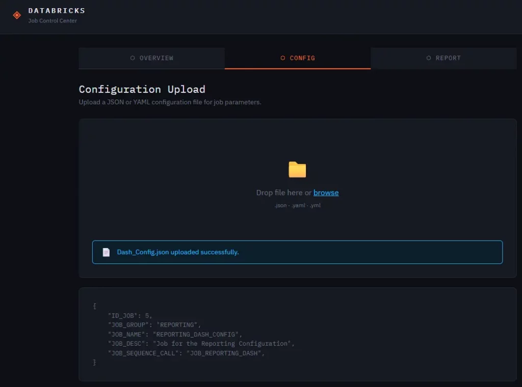
With this approach, it is possible to minimize effort in pipeline development because business users can align the reporting results directly after newly adding data to the silver layer. By defining the job configuration via a JSON file (Figure 2) and adding new KPIs via an Excel configuration, the reporting is much more flexible than with a completely code-based ETL pipeline for the data preparation for the reporting layer.
The Engine: Complex Workloads with Spark & SQL Notebooks
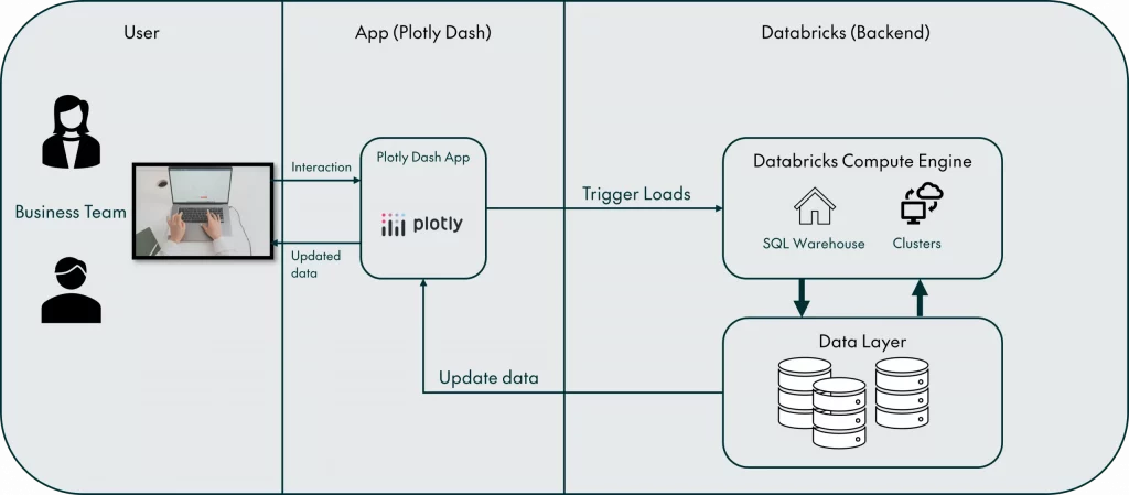
To trigger this configuration, a user initiates an action in the frontend, and the backend handles the configured reporting calculation and built responsive data model. By utilizing Databricks Notebooks in PySpark, developers can:
Build Standardized Workloads: Create consistent logic for both scheduled batch processing and real-time, user-triggered events.
Orchestrate Multi-Step Processes: Execute complex sequences and provide users with immediate feedback by retrieving job status and metadata.
Leverage Distributed Compute: Use Spark’s engine to process massive datasets that would otherwise overwhelm a traditional web server.
Why Architecture Matters
When triggering Spark workloads directly from an application, a scalable and well-defined data structure is essential. Our framework combines large-scale data processing with interactive configurations in Plotly Dash. However, even the most advanced technical setup requires a solid business context as its foundation. This ensures that the data being manipulated remains relevant and provides actual value to the end user.
Governance and Discovery: Powering Business Units via Unity Catalog
A data application is only as good as the data it consumes. Using Unity Catalog, we ensure that the web application operates within a strictly governed environment:
Centralized Access: Different business units see only the data they are authorized to see and to do analysis on.
Lineage: Track how data flows from the raw source to the user-defined report in the Dash app.
The goal of data discovery for all business units is to avoid unclean and inconsistent data quality. The main goal of applications with a centralized data lakehouse is to provide a solution to remove legacy applications. Manual file handling leads to inconsistent data and untraceable data changes. By providing a connected frontend solution, we offer historized and versioned parameters for all entry points in the data processing engine.
Self-Service Architecture: Building Governed Data Marts
One of the most powerful use cases for this concept is the creation of user-defined Data Marts. Instead of waiting weeks for IT to build a new table, a business user can use the Dash frontend to:
Select specific governed datasets from the Unity Catalog.
Apply business-specific filters or transformations.
Click «Generate,» triggering a Spark job that writes a new, governed Data Mart back into the Lakehouse.
We provide a completely separate Unity Catalog for this use case to distinguish between centralized and user-deployed workloads. We create user-defined customized data marts. The main objective of business-led data analysis is to accelerate the delivery of a reliable data structure for reporting requirements.
In the past, when a data analytics team wanted to create a data mart, an entire sub-project had to be hosted. Database deployments, schemas, and tables had to be deployed, and subsequently, several users created Excel exports of the resulting datasets because they wanted to be able to implement aggregations and reporting KPIs on their own. Now, we can deliver a frontend that can build a small Data Mart on top of our existing framework by enabling app users to create a table on top of already existing, standardized datasets.
This turns the data platform into a self-service factory, where the data remains governed, but the agility remains with the business.
Conclusion: The Future is Data-Driven Apps
We combine the flexibility of Plotly Dash with the massive scale of Databricks. This makes it possible to govern data processing via Unity Catalog. With this functionality, organizations can move past static charts and sharing data via exports and file transfers between projects. This architecture allows you to build internal tools that don’t just report on the business—they run it.
In follow-up blog posts, we will provide a detailed overview of building an approach for business-created data pipelines and governed tools to make the data more understandable and usable.
Estimated reading time: 7 minutes