Do you trust your models? – Explainable AI

Why we need Explainable AI
Let us consider a simple experiment: I push a stone to make it rotate clockwise. Now I state that after a few clockwise rotations, the stone will suddenly change its direction and begin to rotate anti-clockwise. You will probably not believe me. Furthermore, if I tell you that I came to this conclusion because the stone is gray, you would completely lose your trust in me. However, if I base my assumption not on the color but on the stone’s length, width, and specific shape, that might be another case. Imagine that the stone has the shape of a rattleback. If you read (or know), what a rattleback is, the situation changes and you will tend to trust my prediction.
It is obvious that explanations give us confidence in the predictions and decisions we make. Or, on the other hand, can make us very suspicious about them (‹the stone will make some strange movements because it is gray›). Also, machine learning (ML) models can greatly benefit from explanations as opposed to hoping that the model already delivers the correct results. In some fields, this would „only“ increase the trust and thus the acceptance of the model, in others this is an absolute basis to use the given predictions.
This brings us to the topic of Explainable AI (XAI). XAI tries to make predictions of ML models explainable. For this matter, a wide range of different methods exists. Some can be applied to common ML models and others are built-in features of models specifically designed for this case. Even if the topic of XAI is still under strong development, hyperscalers like Amazon Web Services, Azure, and the Google Cloud Platform all offer services to explain ML predictions. In this blog, we first want to explain some important definitions when it comes to XAI. Furthermore, we look into the technical fundamentals of different XAI methods to get a feeling of what they are capable of.
Important Definitions
Although sometimes some phrases are used interchangeably or with slightly different meanings, we try to define some of the most important concepts of Explainable AI.
- Interpretability: Describes if it is clear to humans how a model works internally and if they understand the decision-making process. An example is a simple linear regression where we know the weights and can interpete them. On the other hand, black-box models, like deep neural networks, are not directly interpretable.
- Explainability: Describes whether it is clear to humans why a model arrived at a specific decision. We do not have to know the internal decision-making process of the model. In the following section we describe methods that account for explainability.
- Global versus local explainability: While global explainability aims to explain the overall model behavior (e.g. identifying the most important features), local explainability focuses on explaining individual predictions.
- Model-agnostic: If we can apply a method to an arbitrary model, we call it model-agnostic.
Explainable AI – Methods
To get a feeling of how explainable AI works, in this section, we want to discuss two common XAI methods.
Shapley Additive Explanations (SHAP):
SHAP is an explainable AI method based on Shapley values from game theory, which describe the amount a feature contributes to the overall result. Let us assume a model for the prediction of cancellation probabilities of a subscription. To make it not too complicated, we assume a quite low number of only 3 features: Age of the abonnement (F1 = 6), number of complaints received (F2 = 8), and the weekday of subscription (F3 = „Tuesday“). p(x) describes the probability of cancellation which we calculate for every possible combination of features (The values in this case are only examples, but we give an explanation of why they are realistic) :
| p({}) | = | 0.20 | Base probability of cancellation as averaged cancellation ratio over all customers. |
| p({F1}) | = | 0.14 | Customers with a 6‑year-old contract will have a lower cancellation probability than the average customer. |
| p({F2}) | = | 0.24 | Customers with 8 complaints will have a higher cancellation probability than the average customer. |
| p({F3}) | = | 0.21 | The weekday of the subscription will only add some noise to the average cancellation ratio. |
| p({F1,F2}) | = | 0.22 | Customers with a 6‑year-old contract but also 8 complaints will have a higher cancellation probability than an average customer. |
| p({F1,F3}) | = | 0.12 | Adding the weekday of the subscription will only add some noise to p({F1}). |
| p({F2,F3}) | = | 0.24 | Adding the weekday of the subscription will only add some noise/has no influence to p({F2}). |
| p({F1,F2,F3}) | = | 0.21 | Prediction of our model by incorporating all features. This is the prediction we want to explain. |
In our example there are in total 6 different ways of adding features:
- {} → {F1} → {F1, F2} → {F1, F2, F3}
- {} → {F1} → {F1, F3} → {F1, F3, F2}
- {} → {F2} → {F2, F1} → {F2, F1, F3}
- {} → {F2} → {F2, F3} → {F2, F3, F1}
- {} → {F3} → {F3, F1} → {F3, F1, F2}
- {} → {F3} → {F3, F2} → {F3, F2, F1}
It is obvious but important to note that p({F1,F2}) is not just the sum of p({}), p({F1}) and p({F2}). Also, F1 will have a different influence if we add it to the set {F2} or {F3}. Thus, we have to calculate the influence of the features based on every row denoted as pr=x({Feature}).
Let us take the first row as an example. To calculate the influence of adding each feature to the previous combination, we calculate the difference between the cancellation probability after and before adding the feature, i.e.
- pr=1({F1}) = p({F1}) – p({}) = 0.14 – 0.20 = ‑0.06
- pr=1({F2}) = p({F1, F2}) – p({F1}) = 0.22 – 0.14 = 0.08
- pr=1({F3}) = p({F1, F2, F3}) – p({F1, F2}) = 0.21 – 0.22 = ‑0.01
Repeating this calculation for every row yields:
| Row (x) | pr=x(F1) | pr=x(F2) | pr=x(F3) |
| 1 | -0.06 | 0.08 | -0.01 |
| 2 | -0.06 | 0.09 | -0.02 |
| 3 | -0.02 | 0.04 | -0.01 |
| 4 | -0.03 | 0.04 | 0.00 |
| 5 | -0.09 | 0.09 | 0.01 |
| 6 | -0.03 | 0.03 | 0.01 |
Eventually, we average the influence of every feature over all rows and arrive at SHAP values of1
- S(F1) = ‑0.048
- S(F2) = 0.062
- S(F3) = ‑0.001
What can we learn from these values? Imagine, in our case, S(F3) would be for example not ‑0.001 but 0.12. Would we trust the model? Probably not. As we would not trust a person that a stone will change its rotation because it is gray, we would not trust a model predicting a high cancellation probability because the subscription was made on a Tuesday (except we have very good reasons for this assumption). Since our values are instead reasonable, we tend to trust the prediction. We can also try to get some more insights from the SHAP values. By doing so we have – as often in Data Science – to be careful to distinguish between correlation and causality. It is beyond the scope of this blog post to dig deeper into this topic. For those who are interested this article shows a good example.
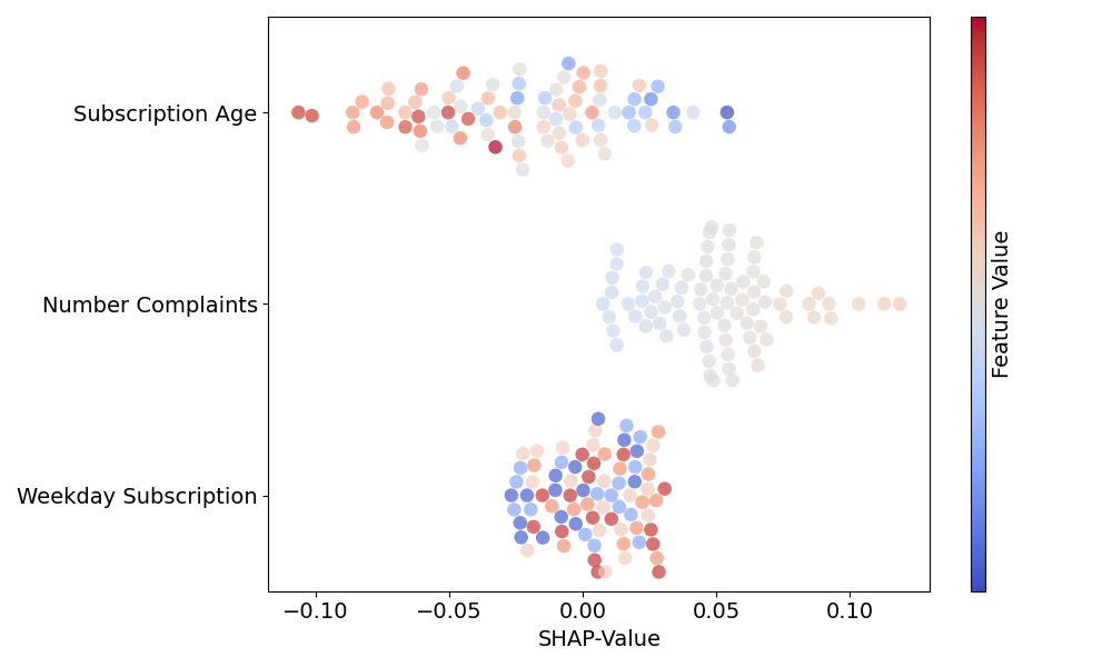
As we often handle datasets with many entries, the SHAP values are commonly displayed in beeswarm or similar plots. Fig. 1 shows an example of such a plot. There, the x-position of each marker denotes the SHAP value of a specific entry while the color displays the feature value itself. For our example we see that the SHAP values corresponding to the subscription weekday are small regardless of the weekday on which the subscription was closed. Also, entries with higher subscription ages tend to have lower SHAP values for this feature and values with higher number of complaints higher SHAP values.
Local Interpretable Model-agnostic Explanations (LIME):
In the SHAP example shown above, the meaning of the features is more or less directly interpretable. Considering a long text that the model handles as embedding vectors or images, where the model recognizes the color channels of the pixels, this would not be possible. Therefore, to be interpretable for humans, the features must be displayed in another way. This can be the presence of specific words for text classification or the presence of specific segments in a picture. Let us skip the math (which you can find alongside a more in-depth explanation in this paper) and explain LIME based on an example for image classification. Assume that the picture shown in Fig. 2 a) is classified by our original model as „banana“.

We can split this image into different segments which we call „super-pixels“. We can state that every of these super-pixels is a feature (Fy) (note, that it is also possible to combine multiple super-pixels to a feature). Now, different images are created where different features are randomly grayed out as in Fig. 2 b). For every of these sample images, the original model calculates the probability for the class „banana“. Based on the probabilities returned by the original model for each of the sample images, we can fit a linear regression model
p = Fw + b.
Here the elements Fx,y in each row x of the matrix F denote whether the corresponding feature is active (Fx,y = 1) or grayed out (Fx,y = 0) in a specific sample image, w is a vector containing the weights wFy of the different features, and b the intercept.
For fitting, the sample images are weighted by the difference from the original image. A sample image that is mostly grayed out has a higher distance and thus a lower weight than a picture with almost all segments being active. Eventually, the returned weights wFx give us the influence of the individual features on the overall prediction of our original model. In our example the weights for features showing the bananas would be large, while weights referring to features showing the apples are negative, indicating a contradiction to the predicted class „banana“. If we would determine explanations for the class „apple“ instead of „banana“, this would be the other way around. For visualization, it is helpful to plot images with only the most contributing features or the most contradicting ones like in Fig. 2 c) and d), respectively.
Thus, LIME can increase the trust in our models as well as help to identify issues in our datasets that otherwise are hard to recognize. This Google Whitepaper gives a good example of critical model training. There, the model was trained to detect diseases from X‑rays. But instead of relying on relevant areas for the diseases the model arrives at predictions based on pen marks from radiologists which are hardly visible to humans.
Conclusion
In this blog post, we dived into the topic of explainable AI by defining some important terms and gaining an understanding of what explainability means in the context of explainable AI. Furthermore, we learned about two common methods used to explain machine learning models. This could help to answer the question raised in the caption with a „Yes, I do“ and greatly improve the debug-ability of machine learning models.
- Note, that we calculated with probabilities in this example. In practice, it would be ensured that these probabilities won’t be negative for example with Log-Odds. ↩︎