Oracle Analytics Cloud – Highlights from the November 2023 Update
Welcome back to our Oracle Analytics Cloud blog series! Today we’re excited to embark on a journey through the November 2023 release. Just like with our September 2023 update blog post, our aim is still the same: to be your guiding light as we go through the most significant, game-changing features that Oracle has in store for us all!
Let’s jump right into this update and unveil the innovations that Oracle Analytics Cloud (OAC) is ready to deliver.
Navigate Canvases using Top Tabs
This new release offers a standout feature: the ability to navigate canvases using top tabs. A top tab is a new user interface element found at the top of the workbook, and it allows you to navigate between canvases. It offers users another way to customise their workbooks and a more user-friendly navigation experience. In comparison with earlier options, this feature now mimics tab-switching in most web browsers, so even new users can switch between canvases with ease. Let’s explore how it can be done with the example below:
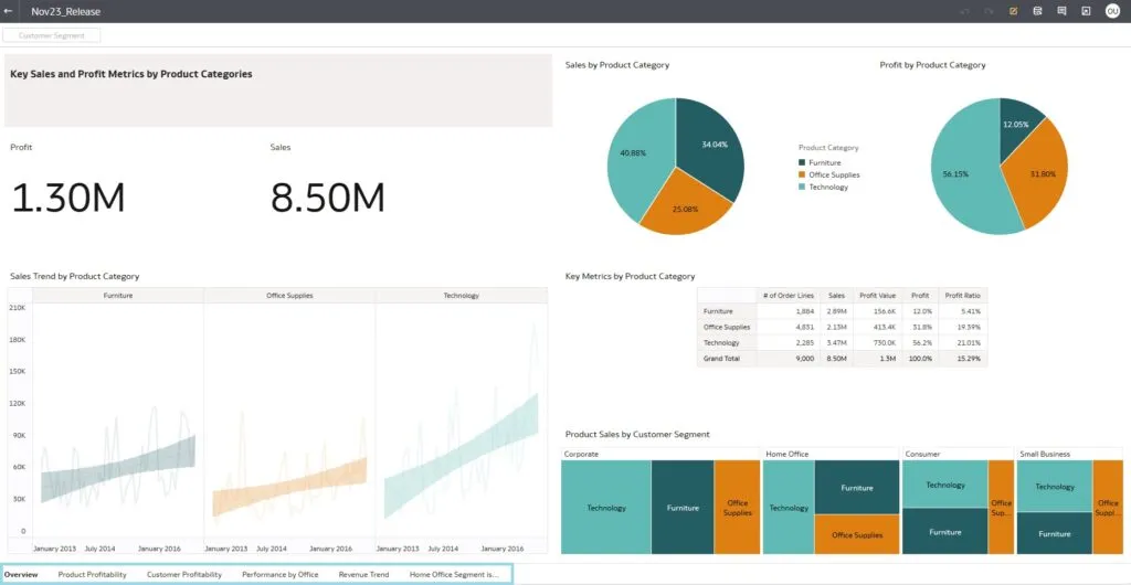
Now, the Navigation tab is at the bottom of the workbook:
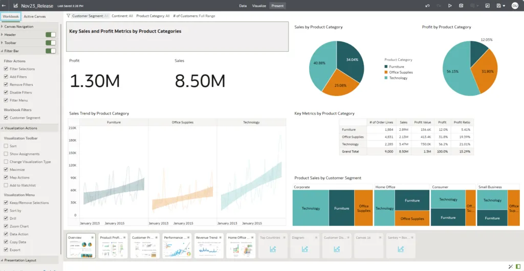
In the Edit mode of your workbook, switch to the Present tab:

Choose the Workbook settings in the Settings pane on the left:
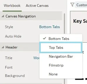
In the Navigation pane, select Canvas Navigation:
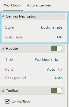
Choose Top Tabs from the Style pop-up menu and save the workbook:
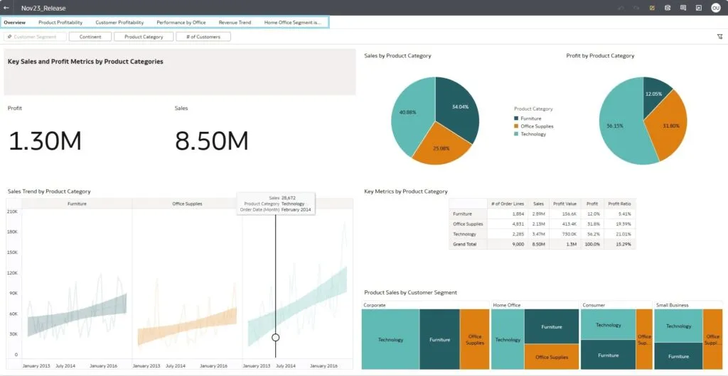
Now you can see the Navigation bar at the top of your workbook:
Specify Workbook and Canvas Header Toolbar Options
Oracle Analytics has introduced an innovative feature that allows users to customise the header toolbar of workbooks and canvases, providing greater control and personalisation options. Conventional analytics platforms often provide a standard header toolbar that doesn’t always align with the specific needs of individual users, but now, instead of being limited to a predefined set of options, users can add or remove functions, thus ensuring that their most-used ones are easily accessible. For example, a financial analyst may want quick access to the Export to PDF and Share options in their workbook header toolbar, to streamline report sharing and distribution.
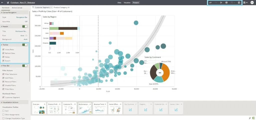
Let’s look at this feature in more detail by navigating to the Present tab and delving into the workbook-level toolbar options, including export, data refresh, notes, undo and redo, and customisation rollback. The options visible to report consumers will be those that users have chosen to enable:
Create and Manage Watchlists as a Consumer User
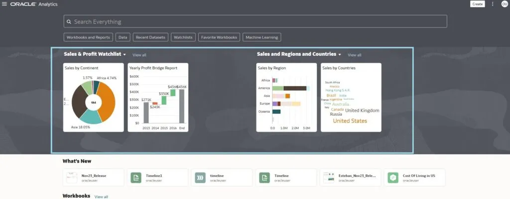
This release offers consumer users an innovative feature – the ability to create and manage Watchlists, a set of visualisations from one or more workbooks that can be displayed on the OAC Home page. With this new capability, users can personalise their experiences by creating their own collections of the visualisations that really matter to them, benefiting from quick and easy access to the information they need.
Watchlists are displayed on your Home page:
You can either add visualisations to an existing Watchlist, or create a new one while adding a Visualisation card. What’s more, you can add and combine them regardless of whether they are located in the same workbook or in different ones.
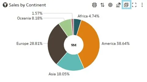
In the Edit mode of a workbook, hover over the visualisation you want to add and click on Add to Watchlist:
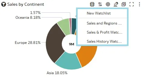
From the pop-up menu choose either New Watchlist or an existing one:
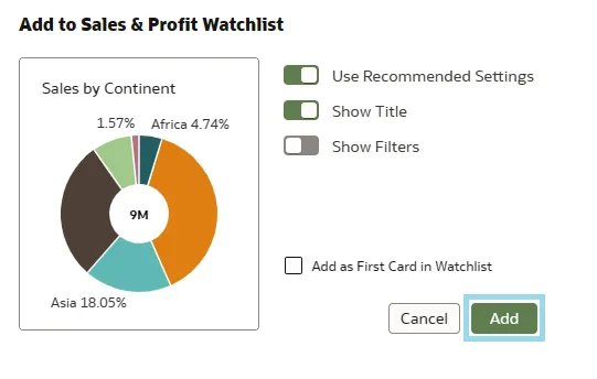
You can change the view of the visualisation as required from the next pop-up window, then simply click on the Add button:
Now your favourite card has been added to the Watchlist!
Format Numbers with Abbreviations
The next feature we’ll look at is for data representation, as this release enables you to format large numbers on your report with abbreviations. You can select the abbreviation not only for numbers but also for currency: thousands (K), millions (M), billions (B), or trillions (T).
To do so, open your workbook in Edit mode and click on the visualisation where you wish to apply the formatting:
From the Properties pane, move left to Values:
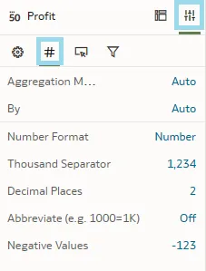
At the bottom, you can see that the Abbreviate option is set to Off. In the previous versions of OAC it was possible to turn this on and the numbers would be adjusted automatically. Now, by clicking on it, various options are displayed, such as K, M, B, and T, and you can choose the one that best suits your needs:
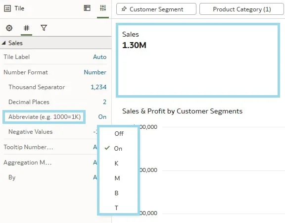
With this modest feature, OAC makes data clearer and more accessible.
Bind Parameters to Filters
We covered the Parameter Binding feature in our recent blog post (Unveiling the July 2023 OAC Release). This longstanding feature in Oracle Analytics Cloud has seen significant improvements and new additions, providing users with an enriched and more versatile set of tools.
At its core, this feature empowers OAC users to create dynamic and interactive data filtering experiences in their reports and dashboards. It allows you to connect parameters to filters and enables a more responsive and personalised approach to data analysis. Dashboards and reports can become more interactive than ever, as users can change filter parameters on the fly, exploring data from different angles and effortlessly drilling down into specific details.
After navigating to the report or dashboard where you want to implement this feature, name the parameters that you want to link to your filters. These parameters could be time ranges or minimum and maximum numeric values.
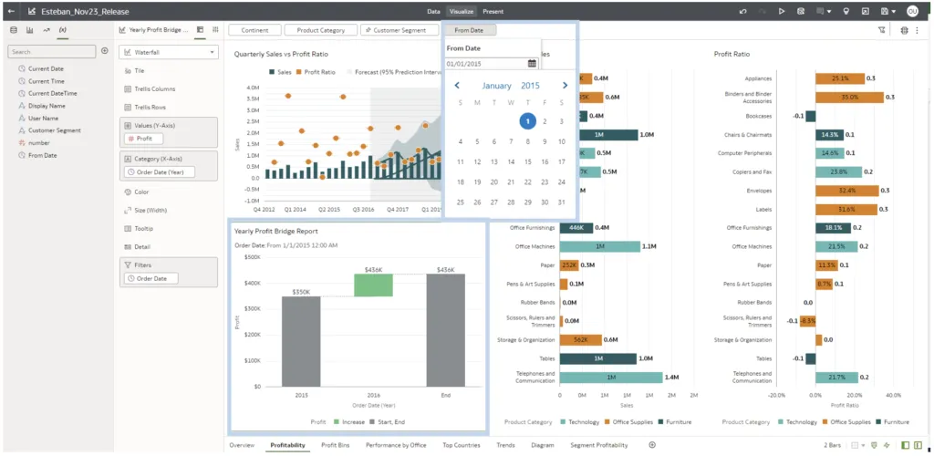
In the next example, we will see that users can easily select custom date ranges, providing a more meaningful view of time-based data. We created the parameter From Date, allowing users to input their starting point by binding this parameter to the visualisation filter. In this case, after introducing Order Date as a visualisation filter, we modify the operator from Range to Start At and proceed to parameterise this date value with the recently established From Date parameter:
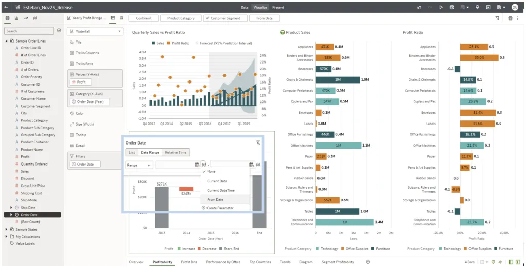
Users will be able to dynamically select any date from the From Date parameter found on the Filter tab. For instance, if a user inputs Jan 1, 2015, the waterfall chart will display profit numbers starting from that date:
Change the Line style in OAC Visualisations
The next new feature we´ll explore lets us change the style of lines in OAC charts and control line style, thickness, and transparency, enabling the customisation of visualisations.
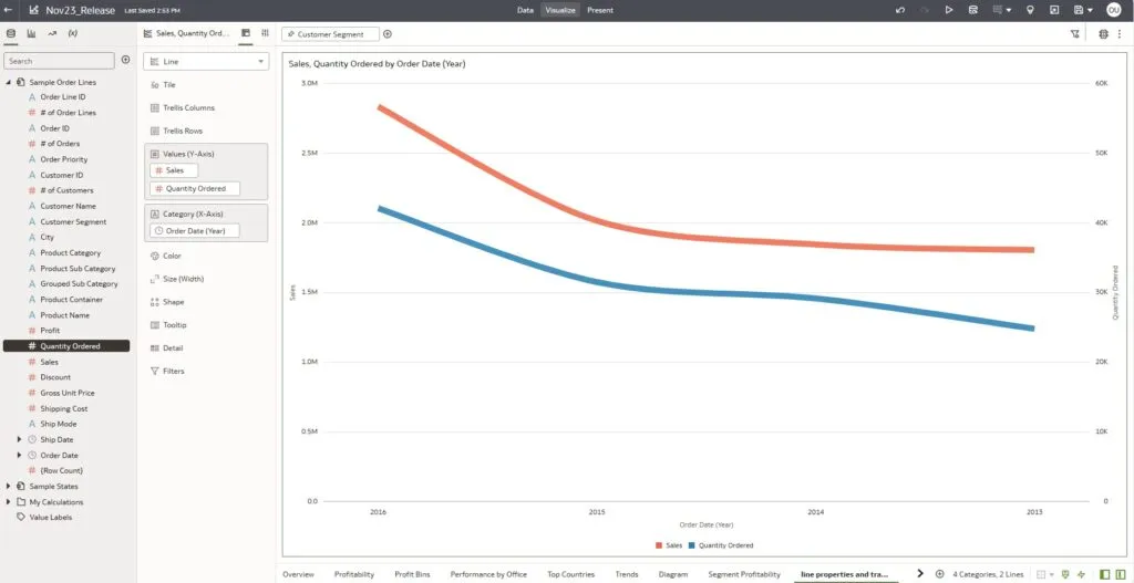
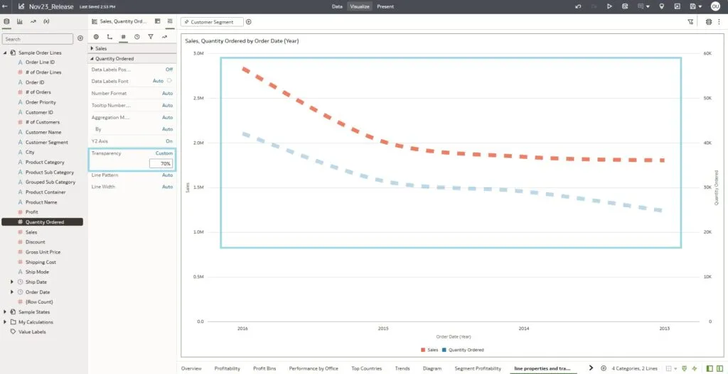
Let’s have a look at how it works with this simple example of a line chart that shows Sales and Quantity ordered by Order Date:
To change the style of line, go to the general Visualisation Properties pane on the left:
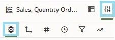
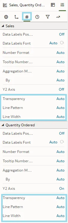
Under Line properties, Oracle has added new parameters that can be changed according to your preferences:
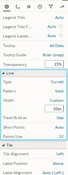
There are 3 types of line pattern (Solid, Dashed, or Dotted). In our example, we change it to Dashed:
The properties set under the general tab apply to all the lines in the visualisation. However, if you switch to the Values tab, you will notice that the properties are now split for the values displayed on the chart, offering the opportunity to adjust the style for each line separately:
For example, by changing the transparency of the Quantity Ordered measure, you can put the focus more on the Sales measure, and vice versa:
This feature allows us to represent different measures in a more graphical and visual manner, and it’s available not only on the line chart, but also on all OAC visualisations that support lines.
Conclusion
Oracle Analytics Cloud has unveiled a series of exciting new features designed to improve the way users interact with their data. For example, with the introduction of Watchlists, OAC offers users a customised and efficient way to access their favourite workbook visualisations. Many other powerful features, such as customised navigation thanks to top bars, specifying workbook or canvas headers, the ability to work with parameters in filters, plus a wealth of other performance, data modelling, and storytelling updates, prove that OAC is once again showing its commitment to enhancing the analytics experience. As OAC continues to evolve, it remains at the forefront of data analytics, and with this latest release it promises to refine your data-driven decision-making process.
Our team here at synvert is ready to assist you in exploring the full potential of the latest OAC features. Whether you need a detailed walkthrough of what’s new, tips on how to best apply them to your data, or if you just have some questions, our experts are only a message away. Connect with us today to unlock the full power OAC and transform your data analytics into a visual narrative that brings your data to life!