Unveiling the July 2023 OAC Release: Key Enhancements and Insights
The July 2023 Update for Oracle Analytics Cloud came out just a few days ago, and in this blog post we are going to look at its most important new features. Here is a comprehensive list of all the features and bug fixes.
1. Enhancing Data Visualisation: Spark Charts in Performance Tiles
Performance tiles are a valuable feature commonly used in dashboards and home pages to provide users with a quick overview of key information. Oracle‘s latest release introduces an exciting addition to performance tiles: spark charts. Today we’re going to see what spark charts are and how they enhance data visualisation within performance tiles.
What are Spark Charts?
Spark charts are compact visualisations that effectively present data trends or patterns in a condensed format. These small graphics are designed to offer simplicity and compactness, making them ideal for situations that require the representation of multiple metrics or KPIs in a limited space.
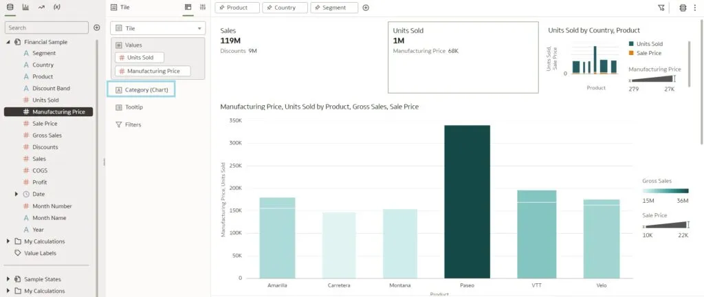
Now let’s take a look at how to configure spark charts in a tile visualisation. As we already know, tiles in OAC can take multiple measures, the first being the primary measure and the rest secondary measures. In the image below we can see that Oracle has added a new ‘Category (Chart)’ to the tile viz Grammar panel:
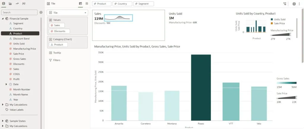
We can add an attribute to this new category edge in the Grammar panel, and once we’ve done so, we will immediately see that a spark chart is generated for the primary measure. By default, the selected chart type is ‘Line with Area’:
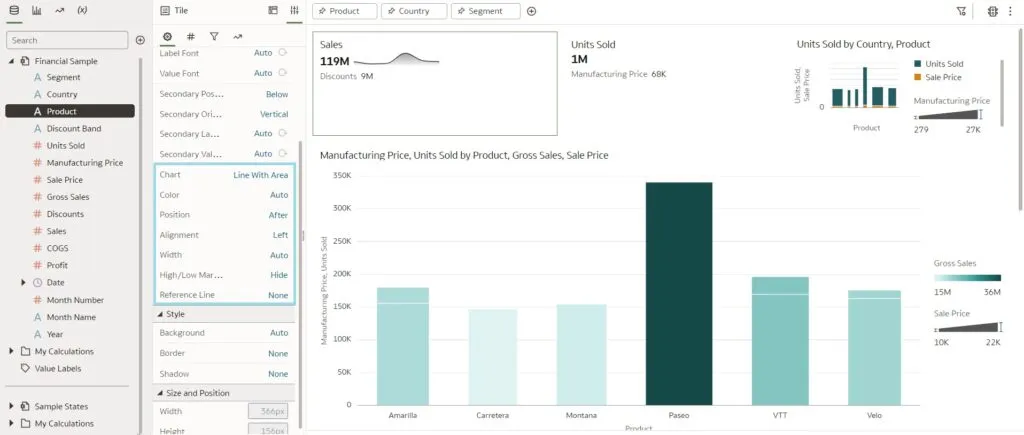
We can also customise these charts by making use of the properties defined in the Grammar panel. In the image below, you can see the properties available for the spark visualisation, and users can also choose from several types of charts, including line with area, bar chart, and area chart:
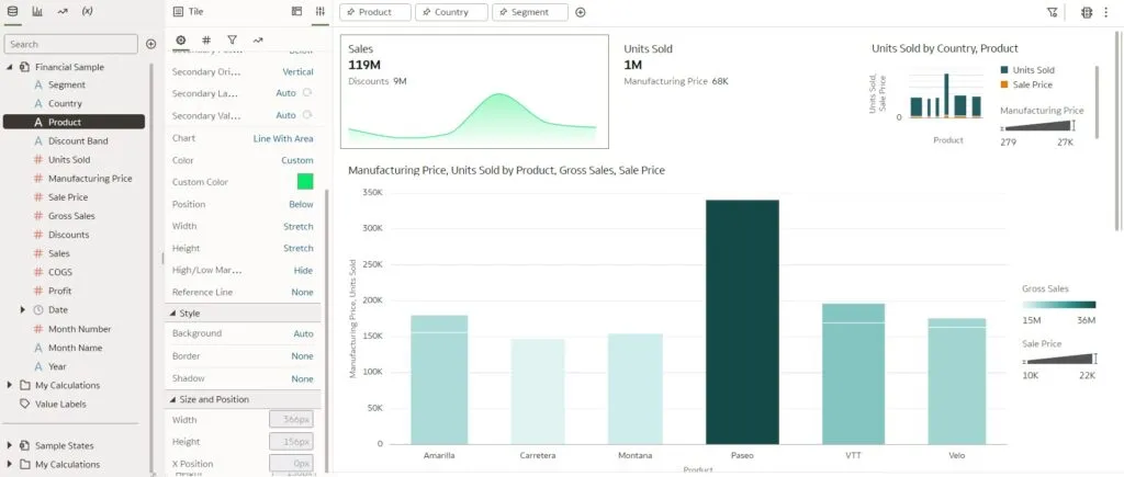
We can customise other features of the chart as well, such as colour, position (above or below), width, height, etc. Here is an image of a tile visualisation with a customised spark chart:
2. Parameter Binding
This is a new functionality released in the July update that allows authors to bind a parameter to a list filter to specify the filter’s value. Binding parameters to list filters enables content authors to dynamically accept, store, and manipulate the parameter’s stored values, and they can control how the filters behave and how they are used in the dashboards.
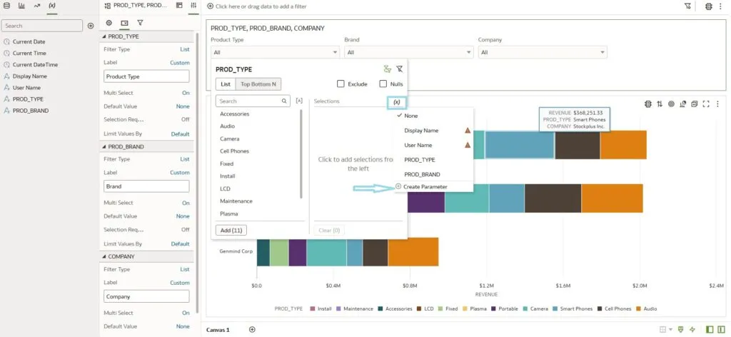
Let’s explore this interesting feature with an example involving the creation of a list filter. When we open the list filter, we can see a new icon in ‘Selections’ that allows us to bind the parameters to this filter. The parameters can be created in two ways: either by creating a parameter from the Parameter panel or by using ‘Create Parameter’ on the list filter, as shown in the image below:
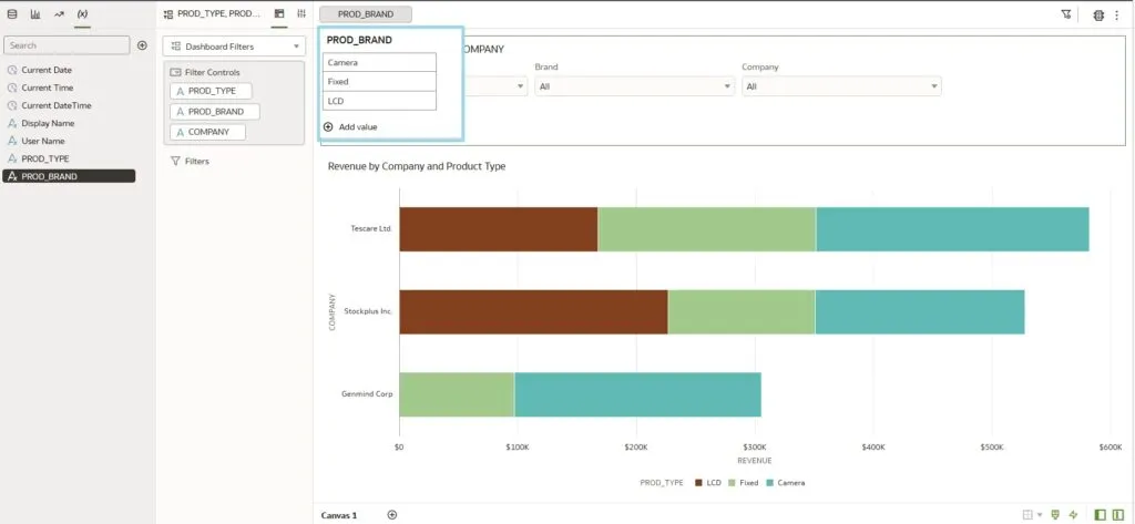
When you bind the parameter to the filter, the parameter takes on the filter value selected by the user, depending on the parameter’s definition. Once the user selects a value in the filter, it is passed to the parameter. To view the values stored in the parameter, you can drag and drop the parameter to the filter tab at the top of the dashboard (see below):
However, if you choose to define the parameter by adding specific ‘Possible Values’ in the Edit Parameter section, the parameter will only accept those specific values when the user selects the filter; it will pass the remaining values. The value in the parameter can be used to filter other visualisations on the canvas.
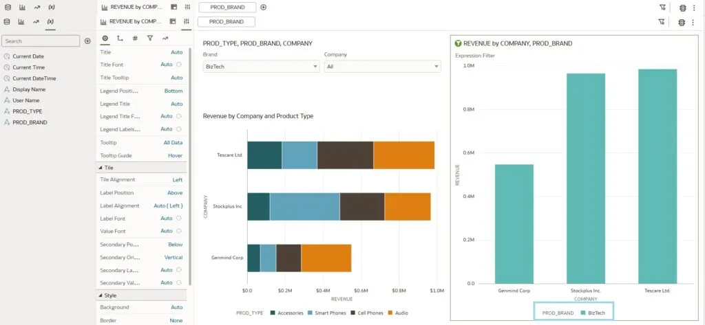
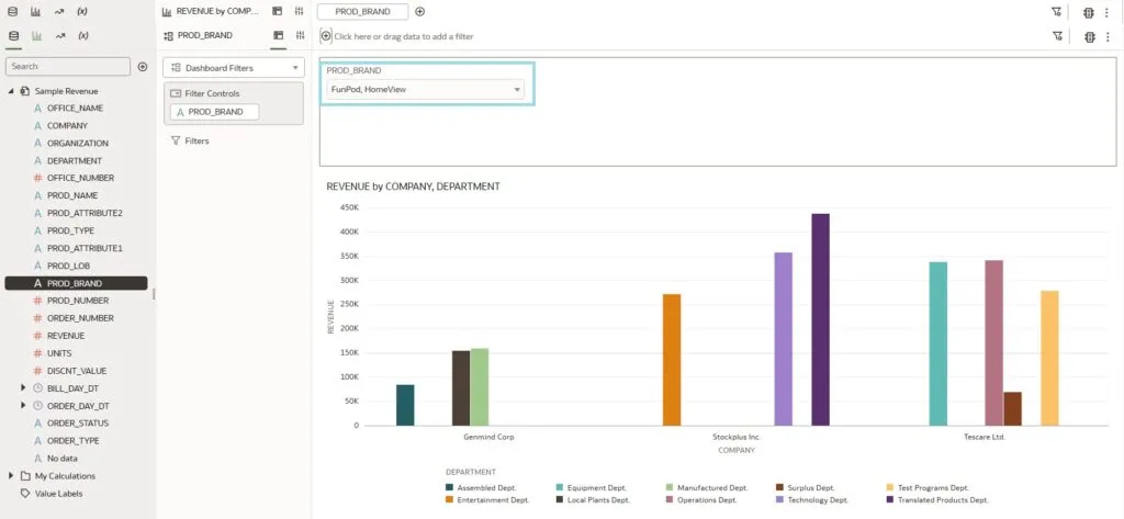
In the example below, we are creating a new visualisation with a bar graph. We will then create an expression filter and add an expression where the Product Band is in the <Parameter Value>. This will automatically filter the new visualisation with the values that are bound to the list filter we created in the example above. In the following image, you can observe that the parameter has passed the value to the bar graph, which is further broken down by Company. You may also notice that the legend displays the value of the parameter:
The parameter binding functionality can also be used to pass the values of a filter control on a dashboard filter across different canvases, whereas before a filter control could only be used to filter values on the same canvas. In the image below, we have created a new canvas from the above workbook and bound the filter control to the parameter we created in the previous steps. When we select filter values in Canvas 1, the filter control in Canvas 2 changes accordingly, and the filter is applied to the visualisations on that canvas:
3. Show/Hide Visualisation Toolbar
Every graph on a dashboard offers a set of visualisation actions that users can take when working with it. Wouldn’t it be great to be able to control which options are available for each graph? Well, that is exactly what Oracle has done in this update! Let’s create a simple visualisation and click on the Present mode on top of the workbook:
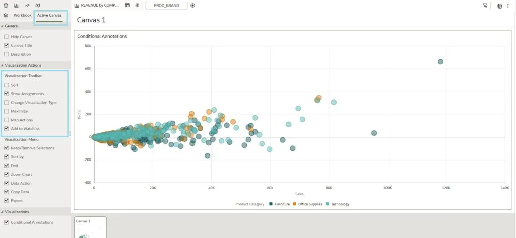
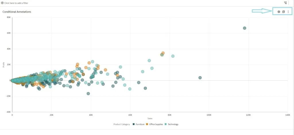
In the Present mode, by clicking on the Active Canvas panel we can see a new properties section called ‘Visualization Toolbar’. With this enhancement, we can choose to show or hide the different visualisation action buttons. Here in our example, we’ve selected a couple of properties to show in the Present mode, and when we preview this, the action buttons appear on the dashboard (see the image below) which the users can see:
4. Data Flows and Sequence Sharing
Data Flow, commonly abbreviated to DF, is a valuable tool for generating data sets directly in OAC from multiple sources, including existing OAS Reports, whilst also allowing for modifications. It is an excellent way to generate workbooks. However, a significant issue existed until now – the inability to share the data transformation object or Data Flow with colleagues.
Only the creator could access it, and there was no functionality available in other OAC objects to grant permissions to users or roles for Data Flows, which in turn meant challenges in maintaining and updating processes because sometimes the object that generated the data set you were working with couldn’t be seen. Furthermore, this issue also affected Sequences, another type of OAC object. (Just in case you don’t know, Sequences are used when you want to run a predefined list of Data Flows in a specific order).
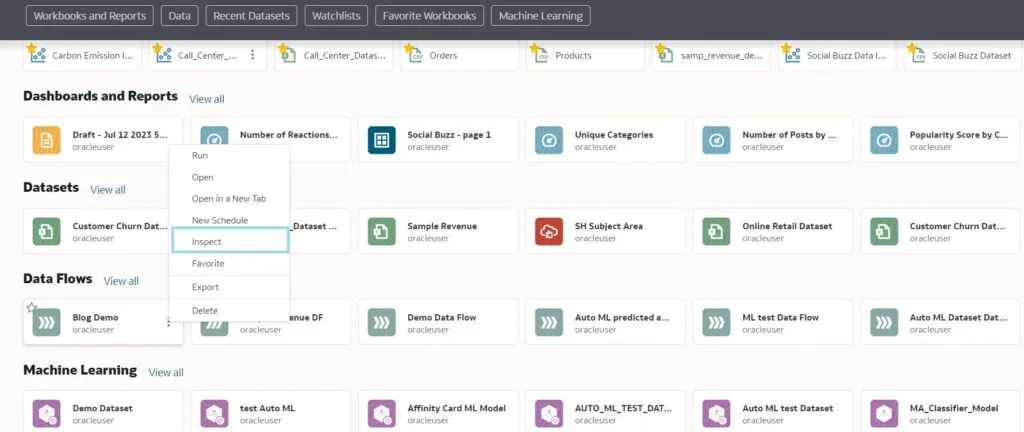
Let’s dive into this feature by creating a simple Data Flow. First go to the Access tab in the Data Flow properties, open the Data Flow in Oracle Analytics Cloud, and navigate to the Inspect tab:
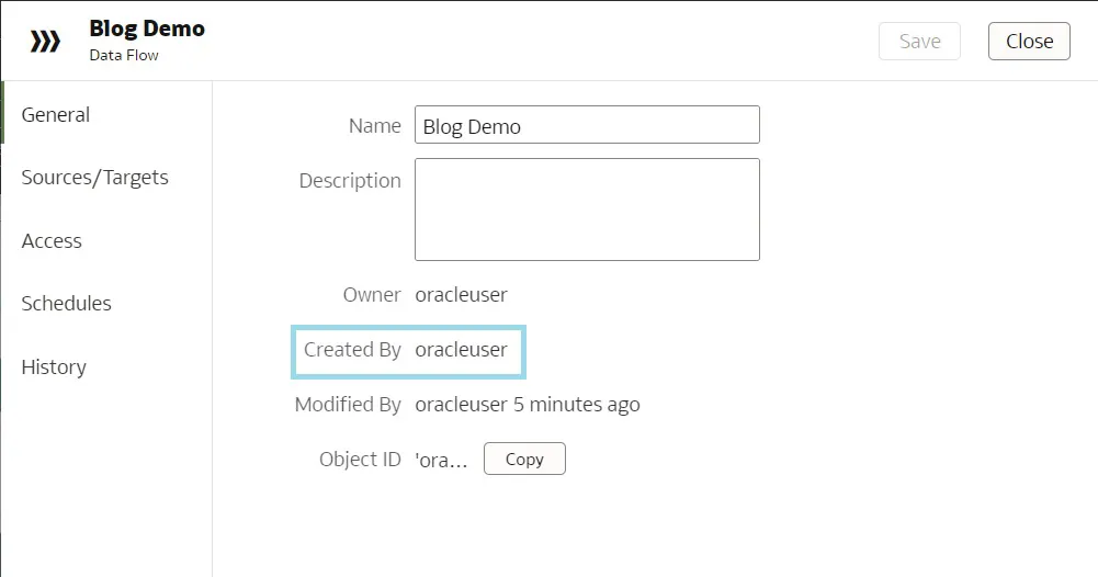
Within the Inspect tab, various tabs for different aspects of the Data Flow properties can be found. Clicking on the General tab enables us to view general information about the Data Flow: the Owner field, which indicates the owner of the workflow (in this case, oracleuser), and additionally we may find an Object ID field, which is mapped to oracleuser too.
Now, we click on the Access tab to view and manage access permissions for the Data Flow. In the Access tab, we can define and modify permissions for users and roles to control who can view and work with the Data Flow, allowing us to share it with other users and to grant them the necessary access rights.
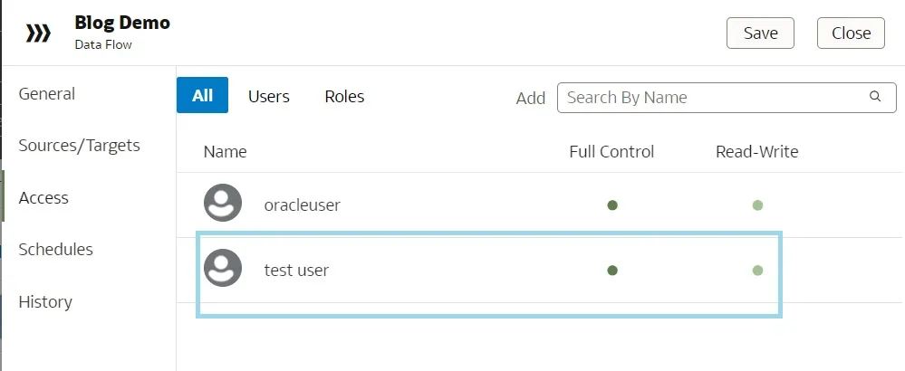
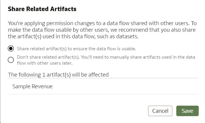
In the Access tab we can see which users and application roles have access to this workflow. We have added a test user to this Data Flow (giving full control access to the new user enables them to modify the access to the Data Flow). After clicking on Save a pop-up appears, allowing us to grant appropriate permissions to the users:
5. Oracle Analytics Data Connectivity
In this new release, Oracle has also added new connections to Snowflake and Vertica data sources when creating pixel-perfect reports. These connections to Snowflake and Vertica are not new, but prior to this release they were not available as sources when using Oracle Analytics Publisher (formerly known as BI Publisher).
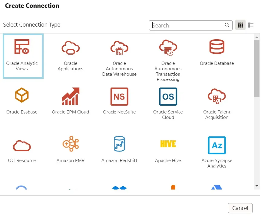
Along with this, Oracle has also introduced a new self-service connector to Oracle Analytics Views. With this feature, the user can find and retrieve existing analytics views to create datasets:
Conclusion
And that was it for this month’s release! We have covered the main topics and to summarise, Oracle is expanding existing tools: tile graphs and parameters are clear examples. We welcome all changes that give more options for users to personalise their reports, especially if they leverage existing functionalities instead of building new ones, which helps flatten the learning curve and allows for a more tailored customer experience.
Our Oracle consultants are especially glad that Data Flows are finally treated as objects and can be shared to users and roles, and now have an easy way to know a Data Flow’s Source and Target. This was a long-desired feature, and we’re sure everyone who uses Data Flows will appreciate it.
In conclusion, this month’s update brings an array of exciting enhancements and new features that empower users to new heights. These key enhancements and insights help users to create better dashboards, analyse data trends effectively, and collaborate seamlessly. Oracle continues to invest in providing a powerful and user-friendly platform for businesses to gain actionable insights from their data, thus enhancing decision-making and driving business success.
Stay tuned as we’ll be bringing you more insightful content soon, and in the meantime don’t hesitate to contact our team of Oracle experts if you want to leverage this technology to boost your business results!