Oracle Analytics Cloud July 2024 Update Highlights
Welcome to another edition of our Oracle Analytics Cloud (OAC) blog series! We are excited to share our impressions on the latest OAC July 2024 update.
In this article, we will explore some of the new features introduced by Oracle in this latest edition, which caters to the needs of both developers and business users. We’ll take you through the key enhancements across different areas, presenting deep insights into how these changes can improve your analytics.
Today we will only cover a few of the new features, but if you would like to see a detailed list of all the new features in this version, please click on this link.
Apply Conditional Formatting to Totals and Subtotals
As we already know, conditional formatting is a powerful tool that allows us to highlight and customise data visualisations based on specific rules. With this tool, we can automatically apply formats like colours, icons, and font styles to make the data clearer and more attractive. This feature is a long-standing element of OAC, and its key functions are discussed in the following blog posts by our consultants: Conditional Formatting and Rule Blending, Conditional Formatting and Oracle New Year Release.
In this July 2024 release, conditional formatting has been significantly improved in both tables and pivot tables, particularly when it comes to the visualisation of totals and subtotals.
To implement this enhancement, we first need to select and configure the table or pivot table where we want to implement conditional formatting, then create the necessary rules for the data:
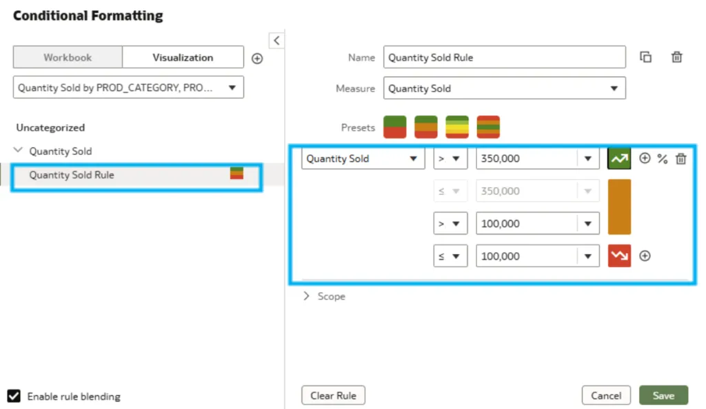
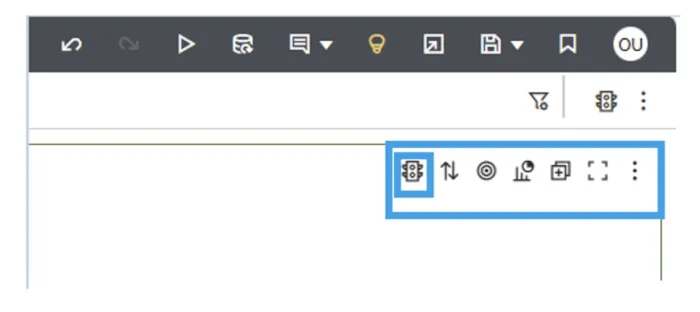
This can be done by clicking on the Conditional Formatting icon located in the top right of our canvas, then defining a rule to highlight values that exceed a specific threshold:
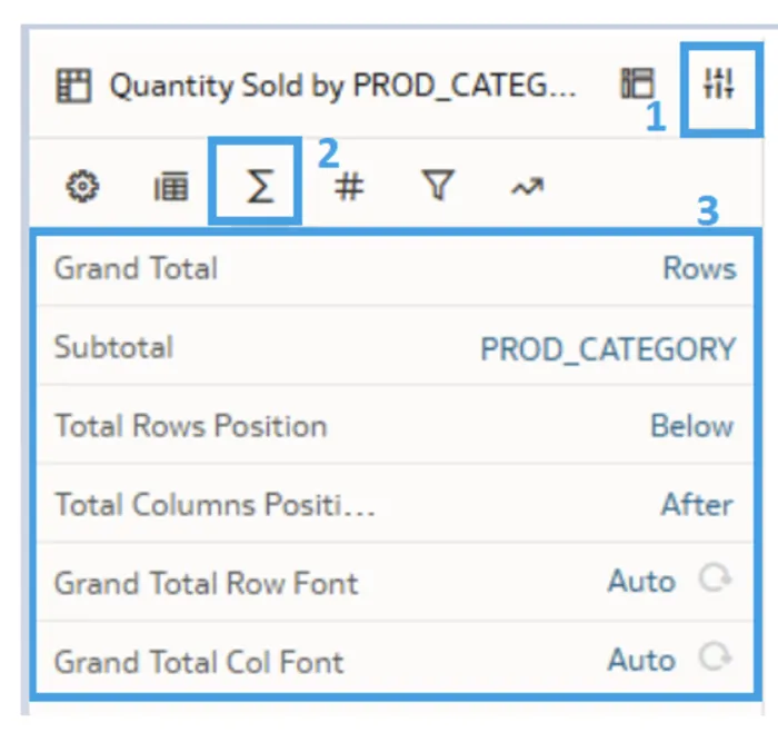
To apply conditional formatting to the totals and subtotals of a table, we first need to enable the visualisation of these values. Start by selecting the Property tab, then click on the Totals icon and enable the totals and subtotals as shown below:
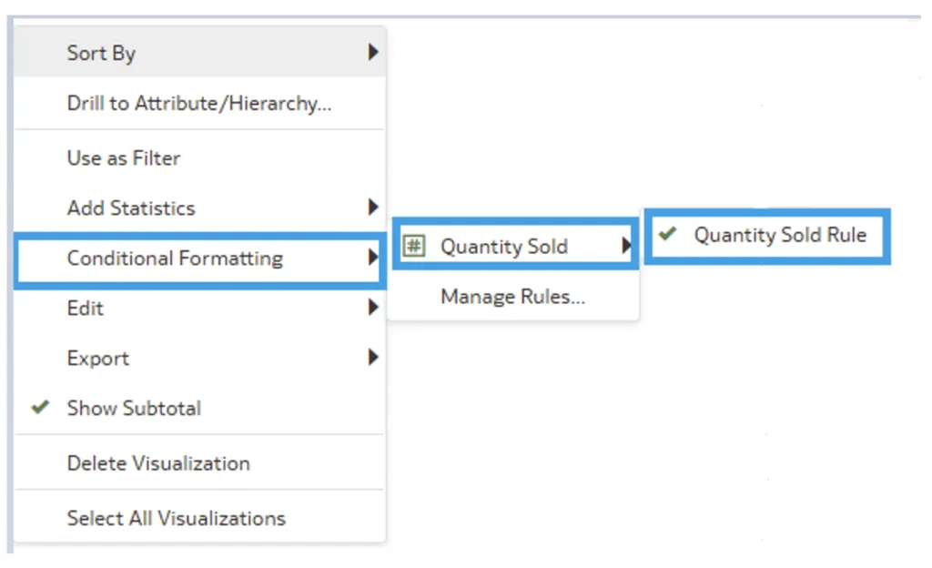
Once the totals and subtotals are displayed, apply the previously created conditional formatting rule to the table. Right-click on the table background and select Conditional Formatting > Quantity Sold > Quantity Sold Rule (which is the rule you generated), as illustrated here:
Then, next to Totals, select the Values (#) icon.
Once you have navigated to the conditional formatting option, select Apply To. Two options will appear:
- Apply to all data in the table.
- Apply only to the totals/subtotals.
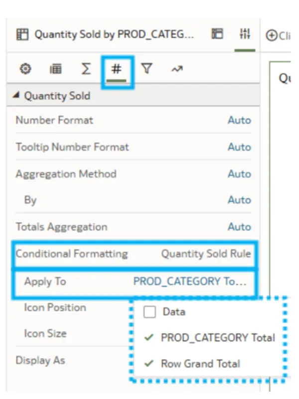
Choose the option that best suits your needs.
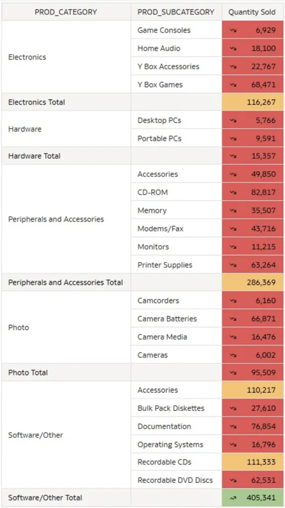
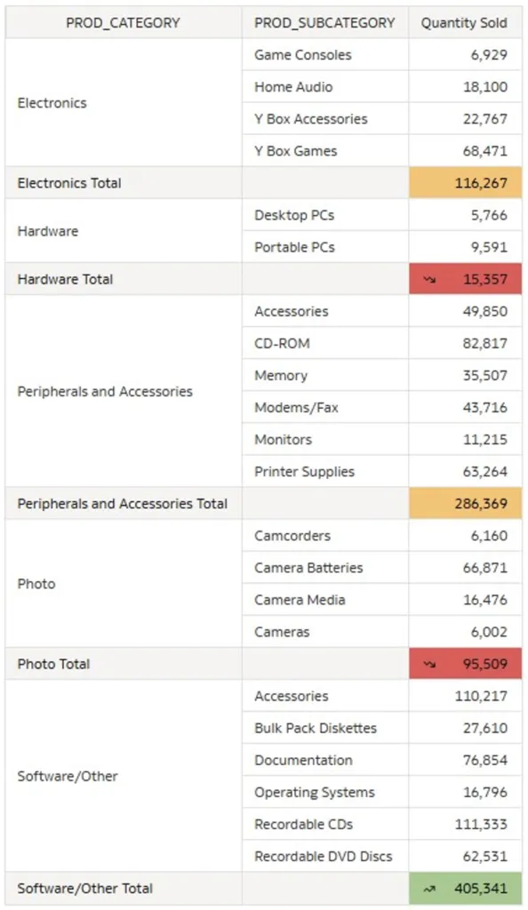
This feature is useful for highlighting the most important data, and the images below show two different data visualisations based on the selected options:
Data & Total & Subtotals:
Just Total & Subtotals Selected All:
As we can see, this new version of conditional formatting helps to improve the visualisation of our data.
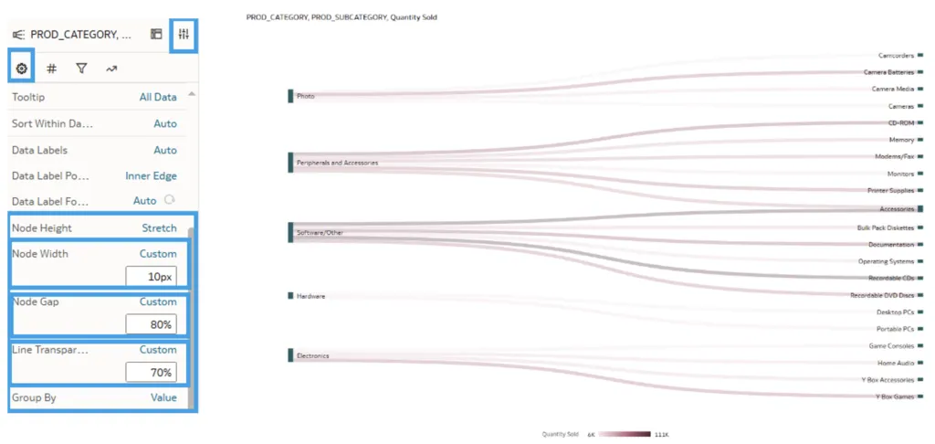
Create Improved Sankey Visualisations
A Sankey diagram is a flow chart that visually represents the magnitude and direction of transfers between different nodes within a system.
In this new release, the Sankey chart properties have been enhanced, so now, when creating a new visualisation of this type, the default Node Height is set to Stretch, but you can change it to Condense. The default Stretch option allows for greater flexibility in graph visualisations.
Below you can see both Node Height visualisation options:
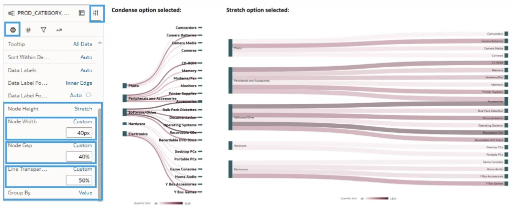
When the first option is selected (Stretch, which you can find in the Properties tab in the General section), two more visualisation settings for the line flow appear:
- Node Gap: This setting allows you to change the width of the nodes and lines, increasing or decreasing them according to your needs.
- Line Transparency: This setting lets you adjust the opacity of the lines in the graph.
You can also adjust the width of the nodes using the Node Width property:
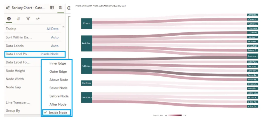
Furthermore, the position of the labels for each category can be modified using the Data Label Position option, allowing us to place the label above, below, or in the middle of the nodes for greater clarity:
Create Precise Relative Time Workbook Filters
The July 2024 OAC update also introduces a useful functionality to apply time filters to workbooks. This new feature allows you to display data for a specific period based on the current date or the end of the last period (such as the last month, year, etc.):
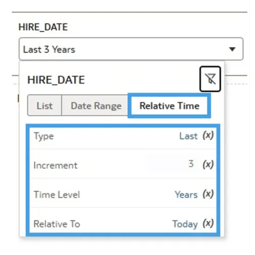
When expanding the filter, a new option called Relative Time appears, providing several parameters to adjust according to your requirements:
- Type: This allows you to decide whether to select data from the past, future, or current day.
- Increment: This sets the period over which you want to move, like days, months, or years.
- Time Level: This defines how you want to view that period (in years, months, days, etc.).
- Relative To: This offers the option to decide whether to display data up to the current date or up to the end of the last period. For example, if Month is selected as the Time Level and it is July, you can choose to include only data up to June, or also the days elapsed in July up to the current date.
This addition is very useful as it allows for the flexible adjustment of data analysis periods, adapting to changes in the current date or the end of specific periods.
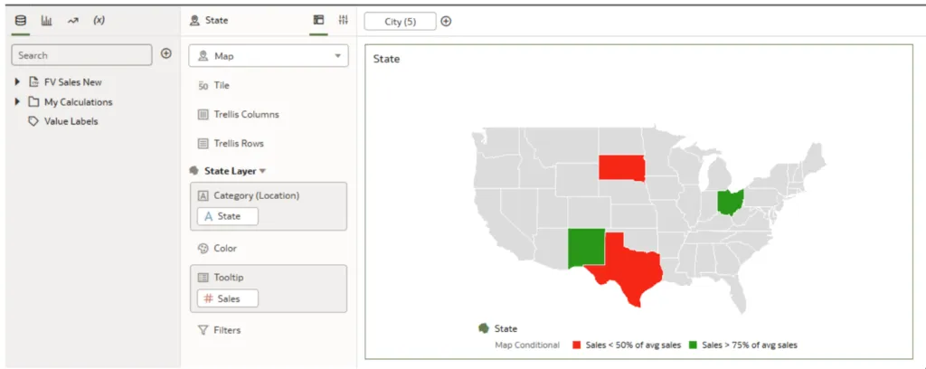
Deploy Vector-Based Map Backgrounds
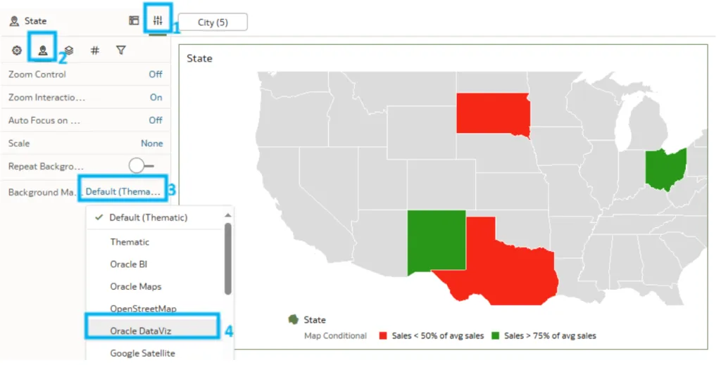
Thanks to this map enhancement, different backgrounds can now be used, letting us change the default map background (usually white) as we wish. Now we can leverage options like Google Satellite, Oracle Maps, and Oracle DataViz, amongst others.
To demonstrate how this improvement can be used in a workbook, we have taken a dataset with information on sales in different states across the USA, and we will visualise this data with a map and add the following condition: if sales in a state exceed 75% of average sales, the state will be shown in green, but if they fall below 50% of the average, the state will be shown in red.
It looks like this:
Now it’s time to apply the new update: go to the Properties tab located in the top left, as shown in the image below. Once there, click on the Map icon and then select the default Background Map. From the options available, we will select Oracle DataViz:
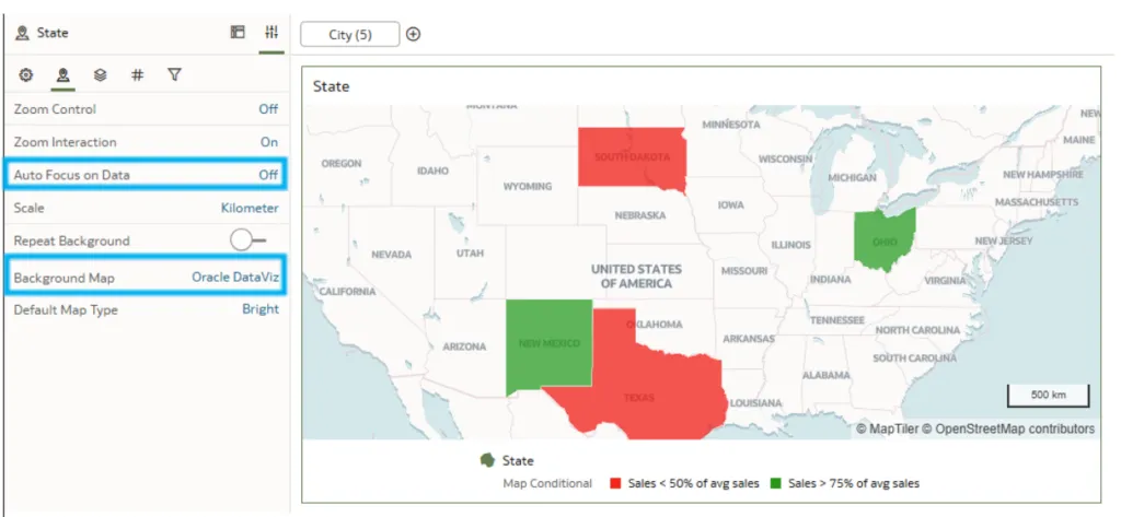
As you can see in the next image, the different names of the states are shown on the map, coloured according to the condition we set earlier. Moreover, with this background map, the Default Map Type option appears, allowing us to change the map mode to bright, dark, or positron. Changes in the map zoom and the type of scale (kilometres or miles) can also be applied. This new feature is useful to visualise and geographically locate the data used more clearly (in our case, by state):
Conclusion
Oracle has added a lot of content dedicated to improving the user and developer experience. This blog post has focused on explaining new topics in exploration, dashboarding, and storytelling, emphasising the features that will be the most useful in our daily tasks. Focusing on improving our data visualisations, this release lets us highlight the most relevant data (like totals or subtotals using conditional formatting) or add more context to the data in the graphics for a better understanding (like the map background).
However, these are not the only new features introduced in July 2024. Other crucial aspects such as data connectivity, modelling and preparation, augmented analytics and machine learning, as well as performance, compliance, and administration have also seen significant improvements, making for a more efficient and user-friendly platform and ensuring that OAC remains a reliable platform for enabling intelligent, data-driven decisions across all levels of an organisation.
Our team here at synvert is ready to support you in exploring the full potential of the latest OAC features. Connect with us today to unlock the full power of OAC and transform your analytics into a visual narrative that brings your data to life!