New Features in Oracle Analytics Server 6.4 [March 2022 Release]

Oracle Analytics Server 6.4 is live and offers a set of features and enhancements which have been available to Oracle Analytics Cloud (OAC) users since the release of OAS 5.9 in March 2021. As the OAS update is yearly, all the OAC updates are combined from over the last year. The new release covers the features from end-to-end process flows, including data preparation, to system administration.
For the complete list of features and enhancements refer to the Oracle document What’s New for Oracle Analytics Server 2022 (6.4). In this blog post, we are focusing on the best new features of OAS 6.4, available for both Linux x86-64 and Windows 64-bit operating systems, downloadable from Oracle e‑delivery.
What’s New?
1. Conditional Formatting:
Oracle has added the conditional formatting feature to its latest OAS release, so end users can apply conditional formatting to the workbooks in data visualisations. This feature was not available in the earlier release and is the result of a workaround.
You can invoke conditional formatting from various places:
- Hover over a visualisation and click on the stop light icon to create a formatting that will be applied specifically to that visualisation.
- Create a formatting rule at project level that applies to multiple visualisations at the same time.
An existing rule can be reused across all visualisations at the same time. This video demonstrates how to use conditional formatting features in Oracle Analytics self-service Data Visualisations.
2. Data Quality Insights:
You can explore your data using Oracle Analytics Data Quality Insights. This feature gives end users an instant visual overview of the contents of all the columns in the dataset. It could be a bar graph or any other visualisation, depending on the content. This helps the user to see some of the quality issues in the data such as misspellings, missing or null values, non-standard column names, etc.
The user can apply an instant temporary filter to the data. When you filter values, Oracle Analytics updates all data columns to instantly display only the rows relating to the filter values you selected. Click again to deselect the filter.
We can perform the following actions with this new feature:
- Rename a column.
- Change nulls into values.
- Rename a value with a misspelling.
3. Annotations on Canvases:
With this feature, you can add notes to canvases and to specific data points to call out areas of interest. You can use notes to annotate one or all of the visualisations on a canvas, or to emphasise specific data points in a visualisation, such as columns in a table or clusters in a scatter plot. There are many formatting options available, like changing the font size, colour, type, etc. A note can be added from the workbook visualisation as shown below:
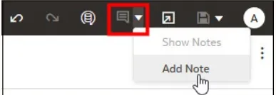
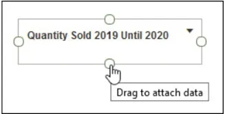
When you add a note, you can add data connectors to call out specific points in the visualisation, or you can create the note and add or adjust the data point connectors later. Here’s how to do it:
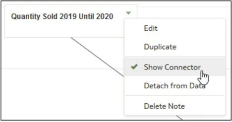
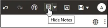
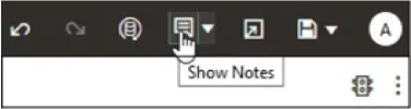
You can also hide/show the notes:
4. Sort Data in Visualisations (Based on Columns not included in the Visualisation):
In this feature the user can sort data in a visualisation with a column that is not included in it. How can you do that? Well, choose the custom sort option from the visualisation and select Sort By, which has different metrics to choose from that are not part of that visualisation.
5. On-Canvas Filter Types:
This new feature allows us to add a filter directly to the canvas so that users can filter the data for some or all of the visualisations on the canvas. On-canvas filters are displayed in the Visualise canvas, Present canvas, and in presentation mode. The filter options are available for:
- Dates
- Measures
- Attributes
You can use the property pane of the canvas filter to change the behaviour of the filter type. Some of the types include top 10 customers by sales, last 5 years’ revenue, top 10 profits by city, etc.
6. Auto Insights:
Auto Insights is a new feature that is a great way to create powerful visualisations using suggestions generated by Oracle Analytics. It automatically suggests a proper insight into any data set created in the Oracle Analytics environment.
Oracle Analytics generates Auto Insights for most dataset types, but there are some that are excluded, such as:
- Multidimensional sources like Essbase, Oracle Planning, etc.
- Datasets based on subject areas.
- Datasets based on non-Oracle databases.
- Datasets generated by data flows.
- Datasets having more than 75 million cells or more than 100 columns.
By default, the feature is disabled for all datasets. The system admin needs to enable them before use from Console | System Settings| Performance and Compatibility| Enable Auto Insights on Datasets.
It is important to note that Auto Insights can also be enabled/disabled for individual datasets. If the complexity of the dataset is causing performance issues, then it’s better to turn off the feature. This can be done by choosing the dataset, Actions Menu | Dataset | Inspect | General | Enable Insights.
7. User and Role Management Enhancements:
There is a new option to download membership data for users, groups, and application roles to a comma-separated values (CSV) file. This data is useful for auditing purposes and also to find out exactly who has what access.
Each user, group or application role in Oracle Analytics Server can have direct members or memberships but they might also have one or more indirect members or memberships. The list of the direct and indirect members for a user, group or application role can be exported to a CSV file for auditing.
This can be downloaded from Direct and Indirect Users | Groups | Application Roles | Export
8. Improved Sort Options:
Visualisations can now display data sorted by multiple dimensions and measures. You can narrow your focus to explore certain aspects of your data by using advanced sort options. Here’s how:
- On the Home page, select a workbook, click on Actions Menu, and then select Open.
- Select a visualisation and click on Menu.
- Click on Sort By and then on Custom.
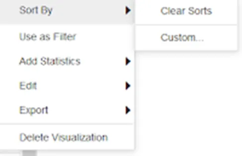
- A dialogue window will open where you can define and arrange the sort order. Use it to configure sorts, and clearly see the sort order and any sort conflicts.
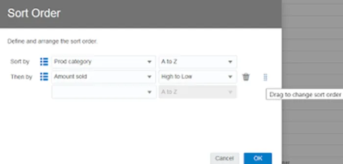
- You can also sort an attribute by a measure column that isn’t used in the visualisation.
Below you can see how this feature is used in various projects:
9. Change Settings for Multiple Columns:
If you have multiple columns that need to have their settings changed, there is no need to do it one by one like in a classic analysis editor.
Unfortunately, this not possible in the Data view, although you can still alter a single column at a time there. However, in the Metadata view, you can update the properties of multiple columns at the same time. Here’s how:
- From the Home page, open a dataset or a workbook.
- To update the properties of multiple columns at the same time, you need to click on the Metadata icon from the toolbar.
- Select multiple data elements to configure and edit; the selected data elements are highlighted and the first has arrows.
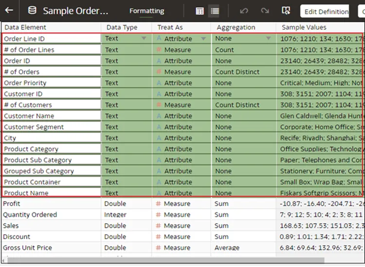
- To configure the property, click on the arrow in the first element and then select the appropriate configuration. For example, by clicking on the arrow under Aggregation you can set all of the measure columns to Count Distinct.
- The changes are not applied to certain types of column.
10. System Settings Enhancements:
With OAS 6.4 there is a new System setting, Repeat Rows on Excel Exports for Tables and Pivots, which specifies whether cells that span rows or columns are repeated when exporting tables and pivot tables to Microsoft Excel.
This feature allows a developer to specify whether the cell in an Excel is repeated at row and column level when exporting from a table or a pivot table, even though it is not specified in the settings of the Analysis editor.
By default, the Repeat rows are OFF in the settings.
Conclusion
This new release really does justice to Oracle Analytics users, as a lot of the new features show that Oracle has been listening to its community. Some features are better than others, but generally this is a big release with a lot of useful functionalities that make reporting easier and the manipulation of data more diverse.
This latest release shows that OAS is going in the right direction, and it has come a long way since its initial release; neither is it trailing behind the competition like Power BI and Tableau. Every release shows cool bits and pieces you would expect from a truly modern BI reporting tool!
Here at synvert we’ve got an experienced team of Oracle specialists who are abreast with new developments and continue to innovate on top of them. So if you’ve got any questions or needs, please don’t hesitate to get in touch with us!