Highlights from The Oracle Analytics Cloud September 2024 Update
Welcome back to another edition of our Oracle Analytics Cloud (OAC) blog series! In this article, we’ll highlight the OAC updates from September 2024 that promise to improve the Oracle user experience.
We’ll also guide you through the features from the Exploration, Dashboarding, and Storytelling areas, offering you detailed insights on how these changes can enhance your analytics.
The Oracle world is huge, so if you want to go deeper into this new version, or revisit previous ones, just click on this link!
Create Calculation-Based Groups More Easily
Oracle, as an analytical tool, is continually optimising its calculation creation. In this release, there are two new features to help you to develop your calculations more easily, which we’ll be covering today.
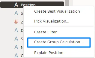
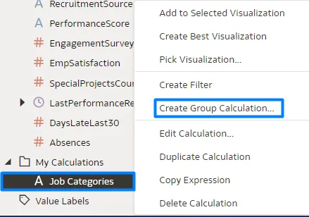
With the first feature, group calculations are now code-free and don’t require extensive logical SQL statements – you can create a group calculation either by right-clicking on the column you want to group, or by selecting the group calculation option from the My Calculations folder. In this example, we’ll group job positions into categories:
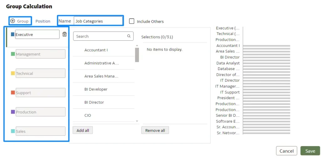
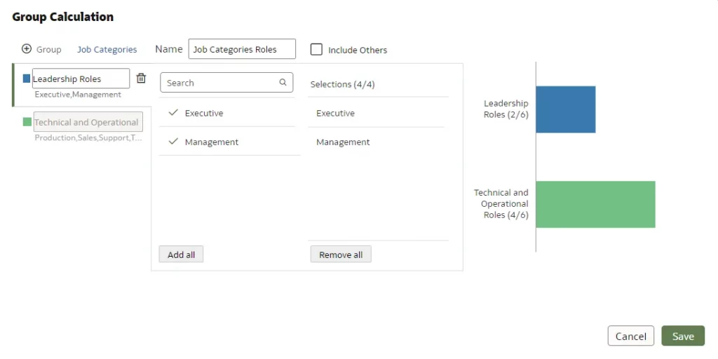
After selecting the Create Group Calculation option, you need to name the group calculation (in this case, Job Categories); then add the desired number of groups by clicking on + Group. The groups will appear on the left, in different colours. In our example, there are six different groups:
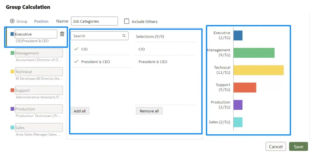
After the categories have been created, you’ll need to assign each value to its corresponding group. In this case, each job position must be connected to a specific job category. As you do this, a real-time preview on the right-hand side displays the categories and the number of values being assigned to each.
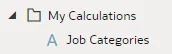
After assigning the values, click on Save. Your group calculation will then appear in the My Calculations folder:
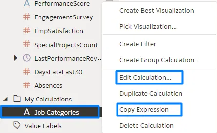
After creating the group calculation, you can right-click on it to either edit the group calculation itself by selecting Edit Calculation, or modify the underlying logical SQL expression by selecting Copy Expression:
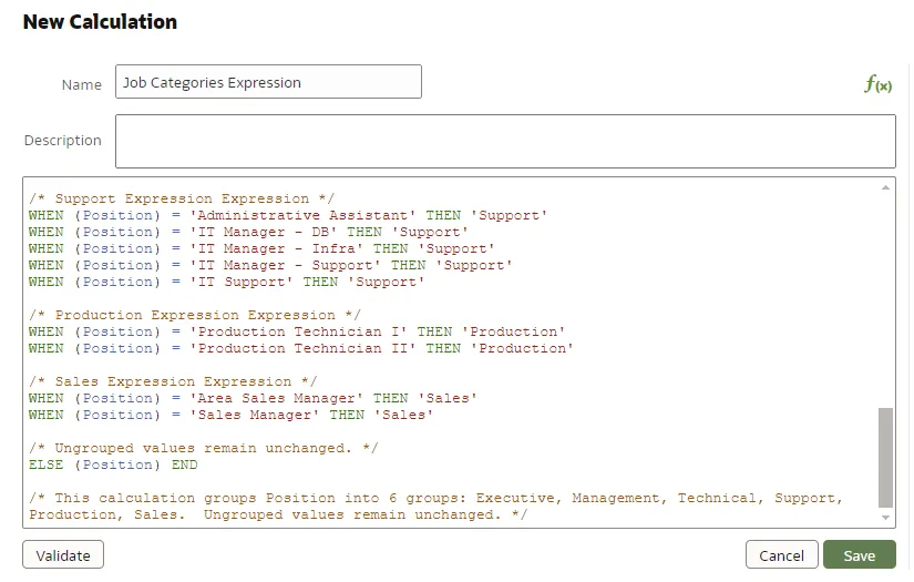
For the second option, Copy Expression, create a normal calculation, then copy the SQL expression and paste it there to make your edits:
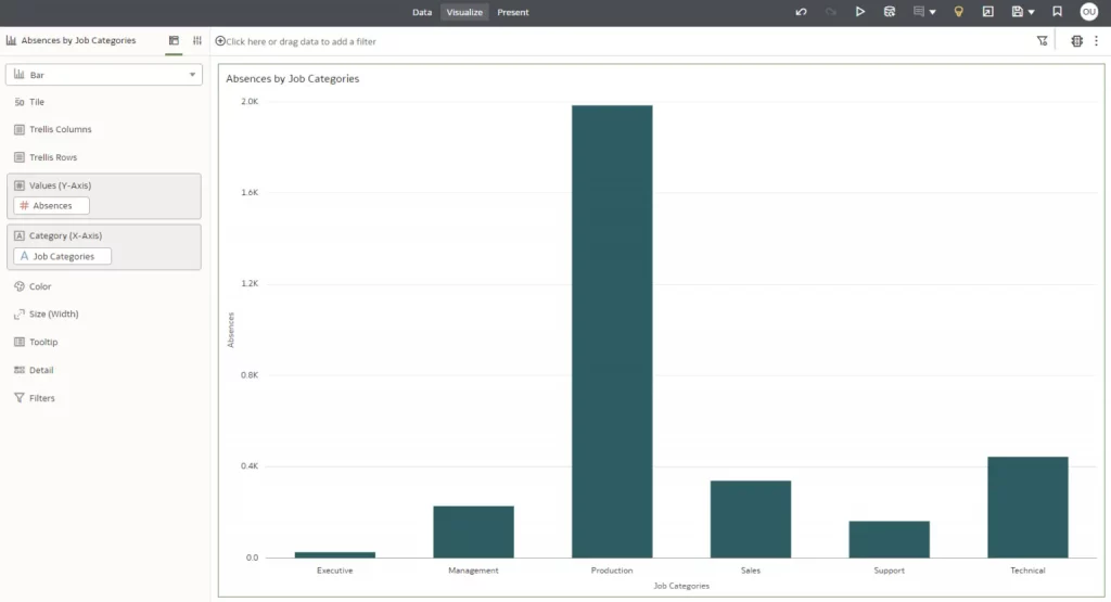
Finally, you’ll be able to create graphics with the group calculation. In this example, we want to see the number of absences for each job category:
What’s more, you can also create group calculations on existing calculations, if they are text attributes, by following the same steps as above. In the example below, the Job Categories calculation that we created is being used to create another group calculation:
Create Calculations More Easily
As you may know, some calculations can be composed of other calculation items; these are commonly referred to as nested calculations. Creating and saving previous calculation items helps you to achieve a more organised and comprehensible final code structure.
This second calculation feature we’re focusing on allows you to create nested calculations without losing their reference while copy-pasting them in a new calculation, item, or notebook…
Let’s see how it works with this example:
Open your workbook in Edit mode and create a new calculation; we’ll use a simple example for the purposes of this article.
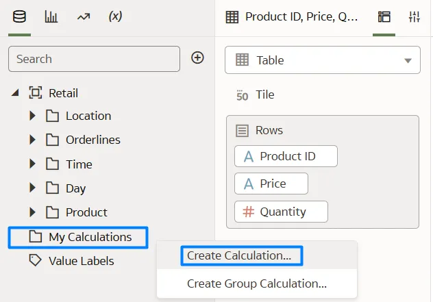
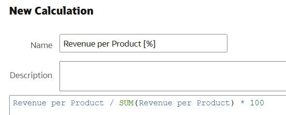
Go to My Calculations and select Create Calculation… then add the following expression and save it with a suitable name:
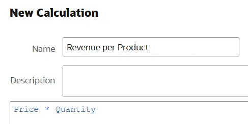
The next step is to create a new calculation, using the calculation from the first step. In this example, we first calculated the revenue per product, and now we will calculate it as a percentage:
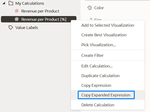
Now it’s time to leverage this new feature. If you want to copy and paste this nested calculation into another workbook, calculation, or a file for documentation purposes, you can use the Copy Expanded Expression option by right-clicking on your new calculation, as shown below:
Once selected, this popup will appear at the top of the canvas:
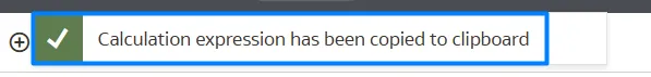
This allows you to copy and paste the expression, including the definitions of the calculated items used within it, ensuring that their references are retained in the expression. In this case, the ‘Revenue per Product [%]’ is:
(“PC1″.”Orderlines”.”Price” * “PC1″.”Orderlines”.”Quantity”) / sum(( “PC1″.”Orderlines”.”Price” * “PC1″.”Orderlines”.”Quantity” )) * 100
To summarise, you can create a calculation in your workbook and use it within another calculation, with the new expression correctly incorporating all the referenced items.
Deploy Static Reference Layers to Maps
You can now add static reference map layers to your map visualisations, even when there’s no business data related to these layers. For example, you could display a map of schools and overlay a static map layer showing a tornado path to identify buildings at risk.
This feature enhances map visualisations by allowing the inclusion of relevant reference data, improving the overall presentation and context.
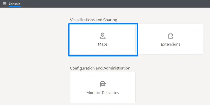
Follow these steps to harness this feature:
Then select Maps from Visualizations and Sharing:
And now select Reference Layers, where you’ll find the option to Add Custom Layer:
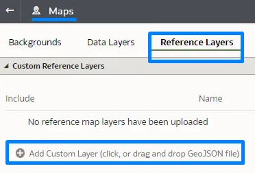
Then ensure that you have a properly formatted GeoJSON file, which will be required for use in the map visualisations. After uploading the file, save it using an appropriate name for easy identification:
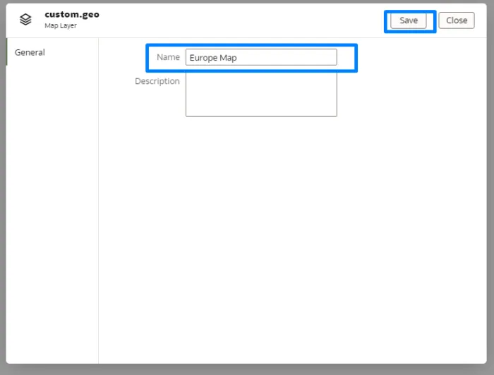
Once the GeoJSON file has been saved, you can now use it directly within the map reports available in your Oracle Analytics Cloud.
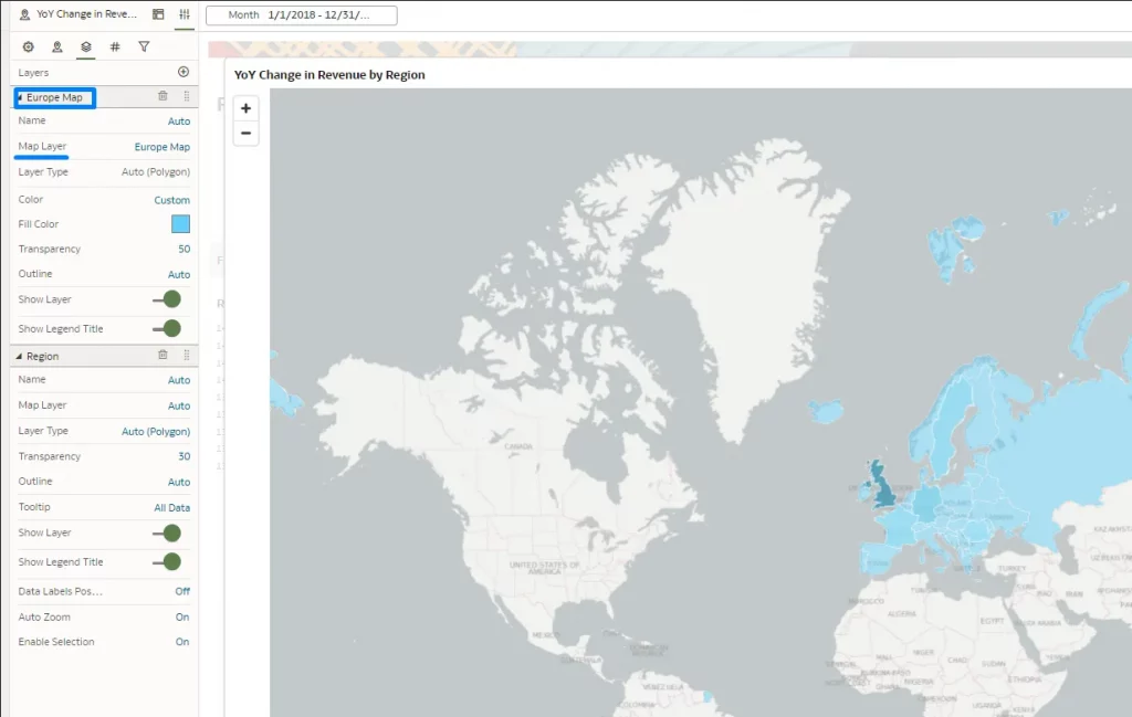
For the purposes of this article, the map will display all European countries on a world map.
To integrate the GeoJSON file into your reports, follow the steps below:
Go to the Properties option, then select Layers, and click on the + icon:
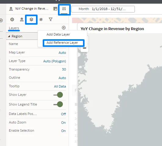
When you click on the + icon, select the Add Reference Layer option and you will see your new layer in the Map Layer section. In this example it’s labelled ‘Europe Map’. Upon selecting the layer, its name will be updated automatically (see below):
This new feature is simple to implement and seamlessly integrates into your reports. It allows the inclusion of external, non-business data, which can enhance your overall analysis.
By enabling richer and more contextual data integration, this feature supports more informed and strategic decision-making.
Select Filter Styles for Dashboard Filters
This update brings new options for dashboard filter styles, providing authors with more flexibility when designing the user experience in workbooks. These new properties, alongside existing ones, give authors greater flexibility in designing an optimal end-user experience in workbooks.
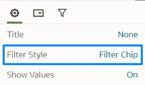
Filter Style
To change the filter style, navigate to the Filter Style property in General Settings and switch from Standard to Filter Chip. While the Filter Type property in the Filter Controls settings remains unchanged, the visualisation differs. In this new filter style, users click on the filter to reveal the data they wish to filter, rather than seeing it displayed directly. This compact filter style not only frees up space for additional charts and visualisations, but also offers greater control over label placement, meaning a more flexible and refined user experience:
Control Style
It is now possible to edit the filter style itself, as well as the background. You can customise colour and transparency settings by going to the Control Style property and adjusting these settings as necessary:

Switch Between Auto and Manual Present Modes
OAC now offers a quicker way to switch between Auto and Manual modes in Present mode, providing users with more flexibility during presentations.
In Present mode, you can choose between Auto and Manual modes, each offering different options for controlling your presentation flow. Auto is selected by default, while Manual offers more flexibility, allowing you to tailor the presentation pace and transitions. If you want to switch to Manual mode, follow these steps.
Open your workbook in Edit mode, and navigate from the Visualize to the Present tab, up in the centre:

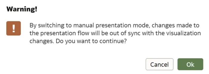
Once in the Present tab, the icon to switch between Auto and Manual modes is located at the bottom of the canvas and is represented by a lock icon. Next to this icon there is a description outlining the impact of the selected mode. When switching between Auto and Manual modes, a pop-up window will appear, explaining the changes that will occur. In Manual mode, you can change the canvas order, rename, delete, duplicate, or hide canvases. In Auto mode, the only available action is to hide a canvas:
Manual:

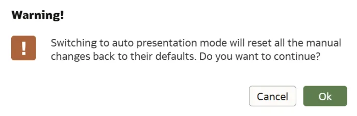
Auto:

For more details on the features and options available in these modes, and to determine which best suits your needs, you can refer to the official Oracle documentation at this link.
Conclusions
This release highlights advancements in calculations and the enhanced power of map visualisations, allowing multiple data models to be visualised simultaneously. A new filter type has been introduced, providing refined control over data interactions and delivering a smoother user experience, improving data exploration. These features are integral to OAC’s Exploration, Dashboarding, and Storytelling capabilities.
As well as the new features introduced in this September 2024 release, OAC has also made significant improvements in other areas that enhance its efficiency and user experience.
In the areas of Data Connectivity, Modelling, and Preparation, one key development is the simplified duration calculation within workbooks. Users can now easily compute the time between two dates or timestamps in units such as years, months, or weeks, streamlining data analysis workflows.
In the Augmented Analytics and Machine Learning domains, the introduction of custom OCI language models is a standout feature. This update allows users to deploy custom models for tasks such as named entity recognition and text classification directly from OAC, enabling more adapted and accurate data insights.
Regarding Performance, Compliance, and Administration, Administrators now have improved control over the default behaviour of filters in workbooks. This feature allows them to define whether filter selections should limit each other by default, offering greater flexibility in managing data interactions and refining the overall user experience.
These updates all ensure that OAC remains a powerful and adaptable platform for driving intelligent, data-driven decision-making across organisations.
At synvert, we are dedicated to helping you make the most of the latest OAC features. Reach out to us today to enhance your data analysis and convert your insights into impactful visualisations!