Autumn Update – Exploring the September 2023 Oracle Analytics Cloud (OAC) Release
Welcome to our blog post, where today we´ll run through the latest September 2023 update. In this article, we’ll walk you through the most significant new features that Oracle Analytics Cloud has to offer, and whether you’re a seasoned user or just curious about the world of analytics, this update has a lot in store for you! Let’s jump right in and see what’s new.
Enforce the Parameters List of Values and Validation in Oracle Analytics
In this blog post, we´ll explore three key enhancements that have been incorporated into the parameter creation and editing experience in Oracle Analytics.
Validate SQL Statements for Parameter Values
Amongst the standout features of this process is the capability to define available values through logical SQL queries. This empowers you to dynamically retrieve data based on specific criteria, eliminating the need to manually enter a predefined list.
Let´s see how it works by adding a parameter to a workbook: when you define your available values using a logical SQL query, you can click on the Validate button to check if your query is correctly formatted and will retrieve the expected data. This real-time validation helps to eliminate potential errors, saving you time with troubleshooting later on in the analytical process.
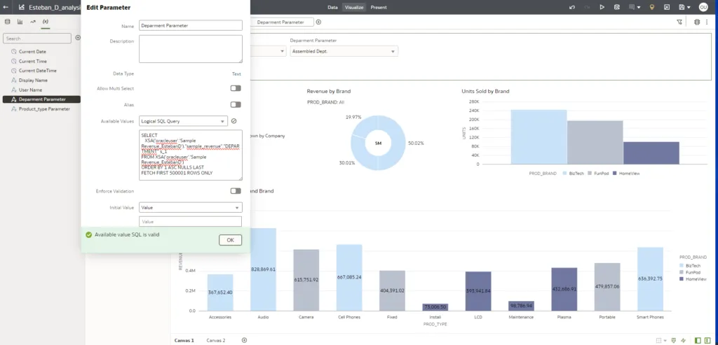
In this case, we built a parameter based on the Department column, and the message that appears when we click on the Validate button indicates that the SQL is correct.
Select A Data Column for Parameter Values
Oracle has introduced an innovative feature, Columns, to define available values within parameters: instead of preselecting values from a fixed list, users are presented with a data tree element that reveals all the columns within the dataset or subject area they are working with.
Let’s look at this functionality by accessing the Parameter tab, then selecting Column as an available value, allowing us to choose from all the columns in the accessible data set:
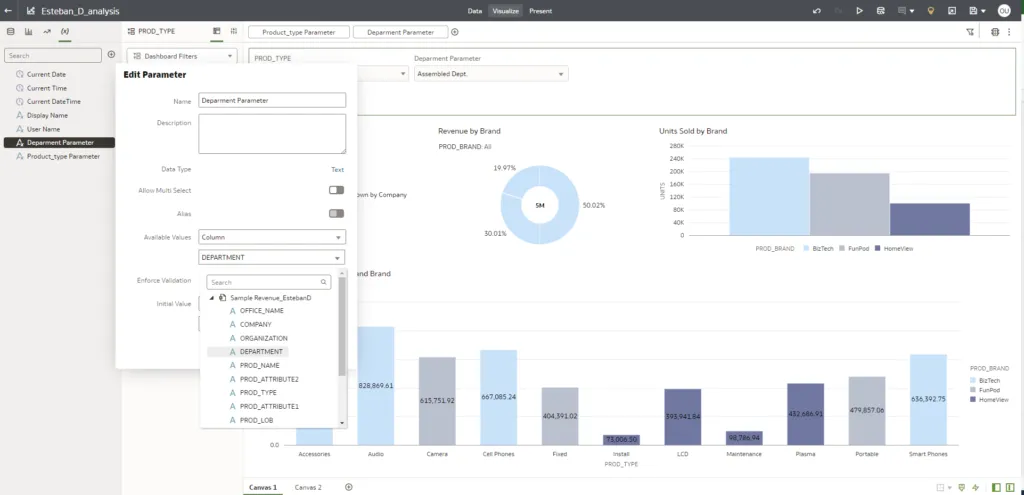
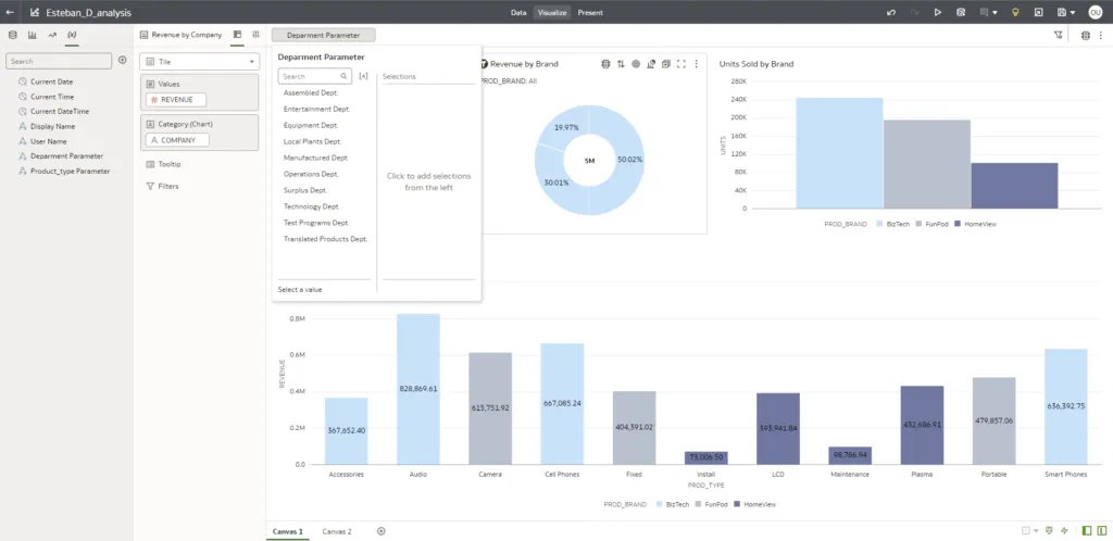
We have again chosen Department as the parameter value. Next, we add this parameter as a filter control on our dashboard, from which we will receive a list of Department values, as we can see in this image:
Control Validation of Parameter Values in Workbooks
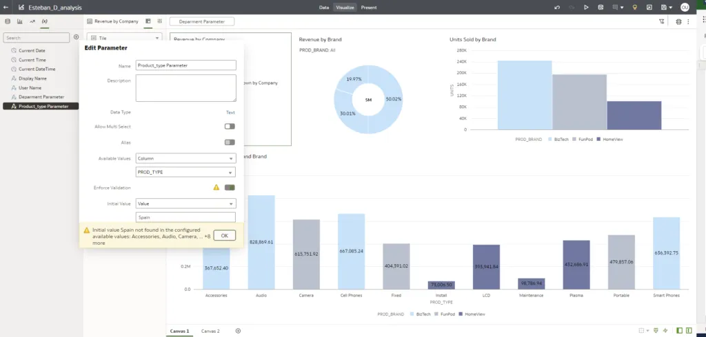
The Enforce Validation feature ensures that the initial value provided for a parameter is validated against the list of available values, and that incoming values are validated at runtime. If a value does not match one of the available options, it is ignored.
To continue with our example, we´ll add a parameter called Product Type. By entering Spain as an initial value for this parameter, the tool immediately validates it against the list of available values and discovers that Spain is not among the available product types:
The Enforce Validation feature is also active at runtime when the parameter is executed. If a user interacts with the parameter control on a dashboard and enters a value that does not match those available, it will be ignored.
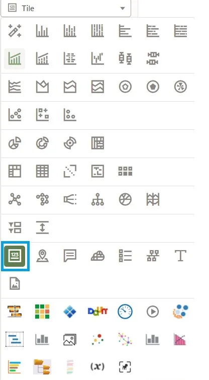
Adding Descriptions to Tile Visualisations
Oracle has added a Description feature for Tile visualisations with its latest release. This feature allows the report developers to provide additional information about the data point the Tile shows, thus making the report or dashboard more informative for end users.
You can add a description to the Tile from the Tile Properties:

By default, this section is set to Auto, but you can easily switch it to Custom and craft the description that best suits your Tile:
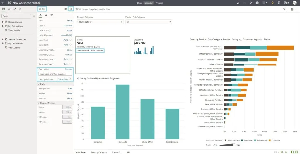
Moreover, you can customise the size, font, and colour of your description.
Whether you’re building dashboards for your team or presenting insights to stakeholders, these descriptions ensure that your audience understands the significance of each Tile. This simple yet powerful addition can turn data into actionable insights, making it easier for users to interpret and act upon the information presented.
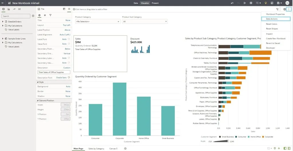
Creating Data Actions from Tiles
Oracle has added a feature that allows you to link the Data Actions directly to the Tile visualisations to make the dashboards and reports more interactive for end users, enhancing the informativity and readability of the report as well as making it easier to get to other pages. This is how to do it.
Let’s assume that you have the Tile that shows the total sales amount on the main page of the workbook, and the second page of the workbook contains detailed sales information. To connect the Tile with the other page, you must create a new Data Action using the pop-up window:
When creating the Data Action and specifying its name, type, and the Canvas link, remember to anchor it to the column that is used for your Tile:
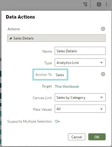
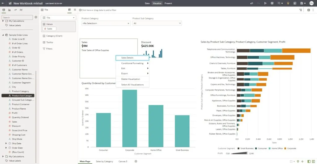
The Data Action is created by clicking on OK, and you can access it by right-clicking on the Sales Tile:
This Data Action will not be seen in other visualisations as it is anchored to the Sales column.
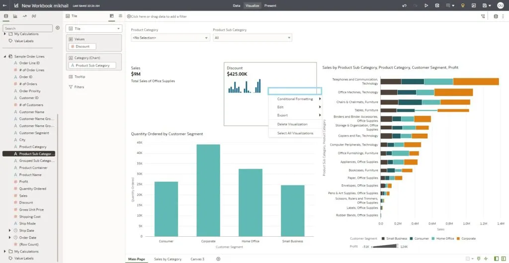
This enhancement not only provides context but also enables users to take immediate actions based on the insights they’ve gained.
Filtering Workbooks using Combo Boxes
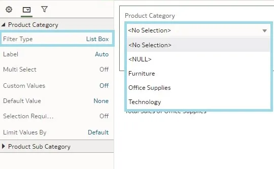
Another new visualisation feature is the List Box filter type. Users have various options when applying filters, including toggling between list and top-bottom end, setting limits by including nulls, or excluding specific selections from the column values. However, in most cases, the user just wants a simple experience, showing the list of values in the column that is used as a filter. OAC has added this new filter type to do just that.
The filter type is easily changed in the workbook edit mode, in the filter visualisation settings in the Filter Controls tab. The property is named Filter Type and it is set to List by default:
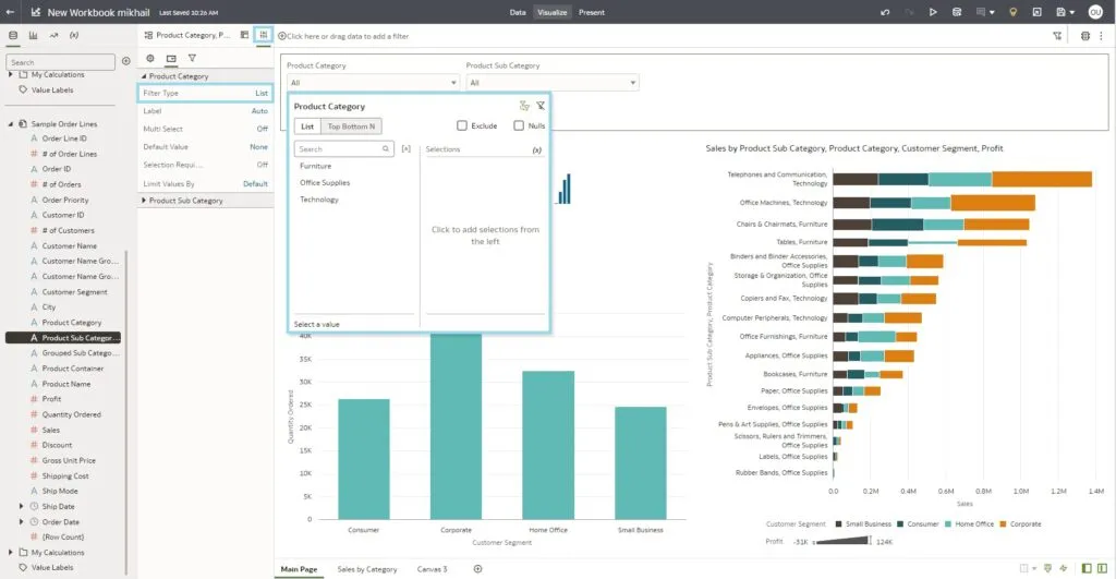
Simply change it to List Box in the drop-down menu:
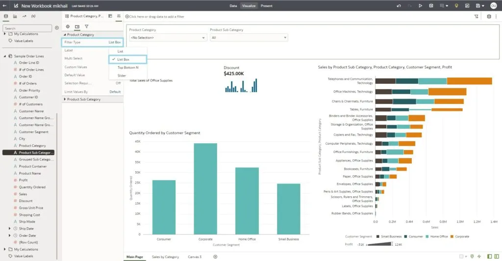
As a result, we can see a very simple view of the column values, as well as the null values and the no selection options:
Show Geometric Details on Maps
Maps are powerful tools for visualising data geospatially, and they become even more insightful when labels are added. OAC now offers a feature that allows you to do this.
Map labels can display crucial details such as state names, category labels, location information, colour codes, and tooltips. These labels serve as informational signposts, pointing those viewing the map towards what´s significant.
Let´s explore the process of adding key information to maps. In the image below we have created a map visualisation with sales details, and in order to configure them correctly, we have to go to the map visualisation properties and select one of the Data Label Position options:
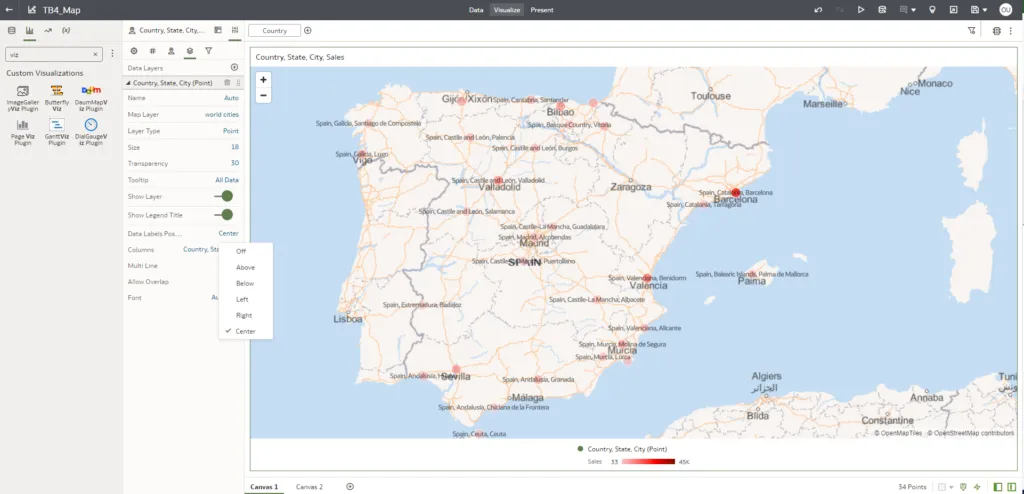
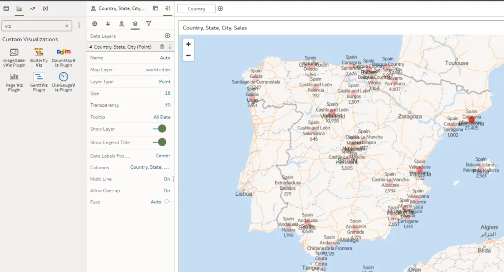
You can choose the ideal position for your labels in OAC: you can opt for a centred placement, or disable labels altogether, based on your visualisation goals. Furthermore, OAC lets you display multiple labels by selecting multiple columns from your map definition, making it easy to convey various pieces of information simultaneously. In our case, we will display country, state, and city.
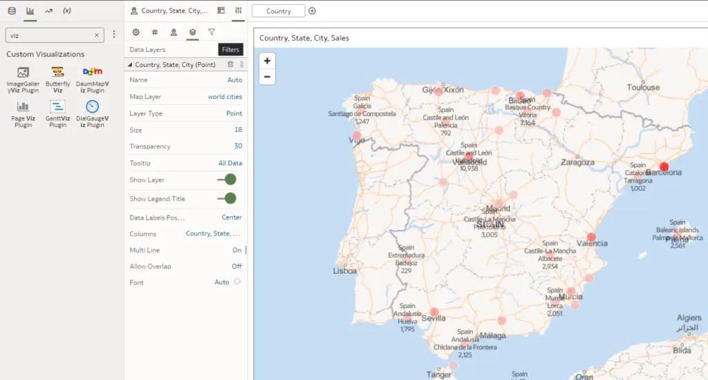
The Multi Line setting is a valuable tool to enhance readability. When activated, it divides multiple labels into separate lines, ensuring that your map remains readable and uncluttered. What´s more, you can control the label overlap to keep everything clear. The Allow Overlap setting intelligently manages label placement, taking spacing and readability into account – check out the difference between the following images with Allow Overlap on, then off:
And with the customisation options, you can adjust the font size and colour to make your labels visually appealing and distinctive, aligning them with your overall visualisation aesthetics.
Share Workbook Links with Options Including QR Codes
This latest OAC update also makes sharing workbooks a whole lot easier. Now, users can effortlessly share their work with colleagues or stakeholders with easy-to-use sharing options.
In the top-right corner just click on the Export button and you will see the pop-up menu with sharing and exporting options:

Now the QR code for sharing is automatically generated and displayed:
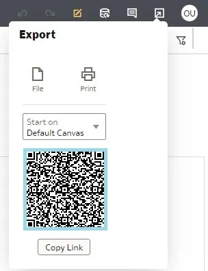
Amongst the options like copying the link or choosing which workbook page will be shared, the integration of QR codes really stands out: users can generate QR codes linked to their workbooks, making sharing as easy as scanning a code with a mobile device. This technology simplifies collaboration and streamlines access to vital insights.
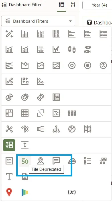
Tile Deprecated
The classic tile, known as Tile Deprecated in the workbook editor, will continue to function in existing workbooks but will no longer be accessible for new workbooks. To add one or more metrics to a visualisation, opt for Tile instead. The two screenshots below offer a comparison between the old and the new:
Conclusion
The latest Oracle Analytics Cloud release continues to push the boundaries of what’s possible in data analytics. With its new features, OAC provides not only a tool for data visualisation but also a tool that provides context and proposes actions.
For organisations that need to make data-driven decisions quickly, these features are game-changers. No matter if you are a data analyst, BI professional, or a decision-maker, OAC ensures that you have the tools to transform data into actionable insights.
If you´d like to see what Oracle can do for your business or organisation, just get in touch with our expert Oracle team here at synvert and we´ll be happy to help you!