Highlights from the Oracle Analytics Cloud March 2024 Release
Welcome back to our Oracle Analytics Cloud (OAC) blog series for another journey through the realm of data empowerment and innovation. We are thrilled to share the new enhancements and updates from the March 2024 release of OAC with you, features that promise to improve the Oracle data landscape even more. Let’s dive in!
1. Set Locale and Language Preferences in Your User Profile
One of the new features introduced in the OAC March 2024 update is the ability to set your locale and language preferences directly from your user profile, making OAC easier to use than ever before for both developers and report consumers, giving you full control and a clear understanding of all Analytics Cloud functions. Let’s take a closer look at how to configure this feature:
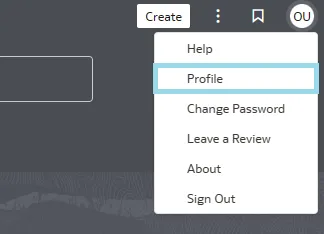
Language preferences are in the User Profile settings menu. Click on the User icon in the top right of the main page, then choose Profile in the pop-up menu:

In the subsequent pop-up menu, you’ll be able to see the Language and Locale settings:
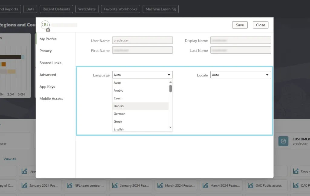
By default, both are set to Auto, meaning that OAC uses your . Now, with this new feature, you can override the browser settings to ensure that the OAC interface is displayed in the language of your choice:
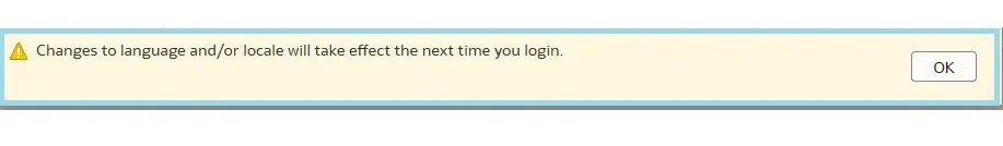
- After selecting the language and saving, a warning message will appear, indicating that your changes will be applied after your next login to Oracle Analytics Cloud:
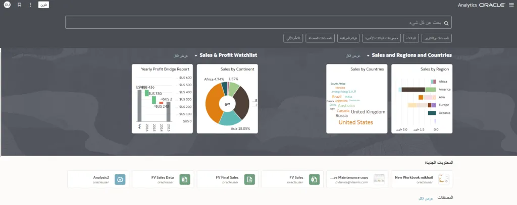
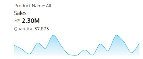
This feature is more than a simple translation: when choosing a language that has different reading rules (for example Arabic, which is read from right to left), the entire platform interface is adjusted according to these rules, as you can see below in the Sales graph:
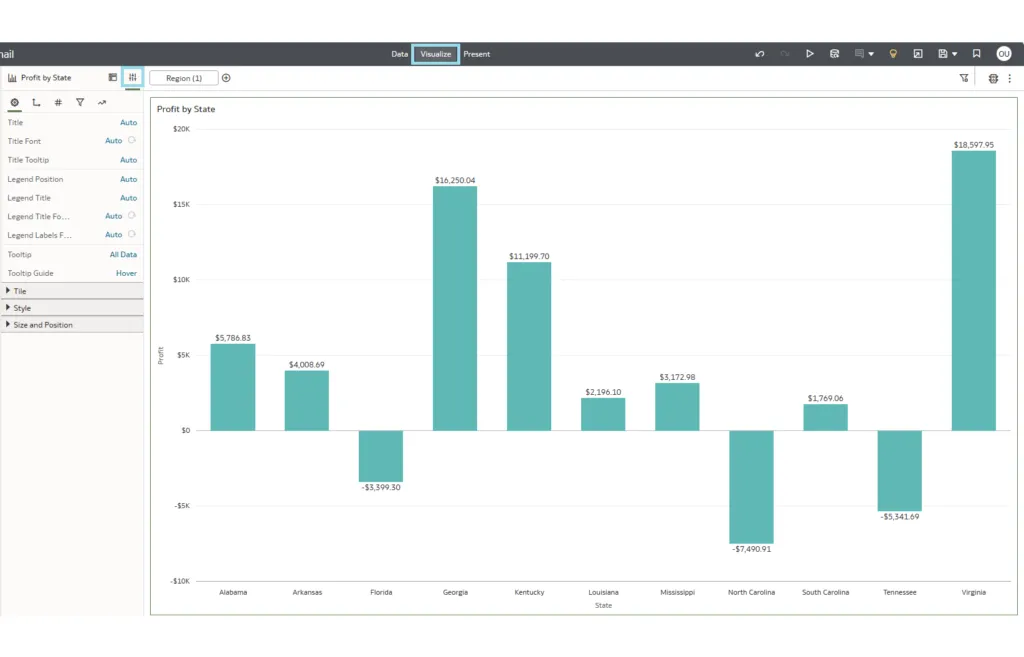
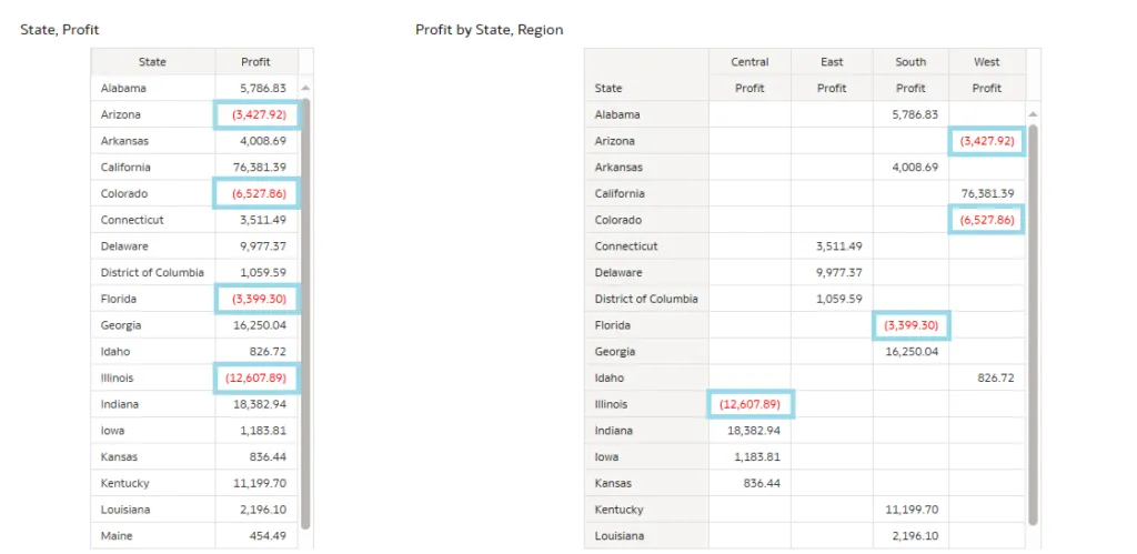
2. Display Negative Numbers in Red
In our blog post on the January update, we discussed the introduction of a new feature that allows for the formatting of negative values on the X‑axis, and the ability to is a significant improvement to this feature in the latest release. This enhancement provides the users with immediate visual indicators, identifying areas of concern or those deviating from anticipated values. So, whether you’re dealing with performance metrics, financial data or any other type of data, you can easily find negative values that are crucial for your analysis. Formatting takes just a few clicks:
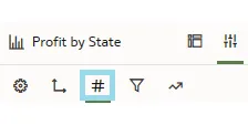
- In Edit mode, go to the Properties panel of your visualisation:
- Then open the Values settings:
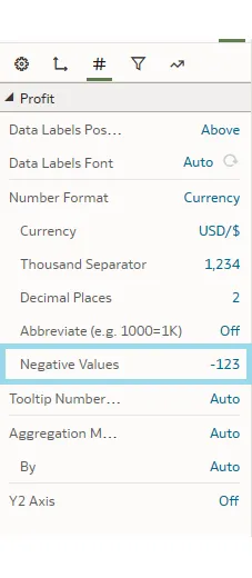
- In the Settings panel you’ll see the option to customise the appearance of negative values:
- After clicking on it, the pop-up window will display the options for negative numbers, two of which are in red:
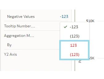
- Select one of them and the change is immediately applied to the visualisation:
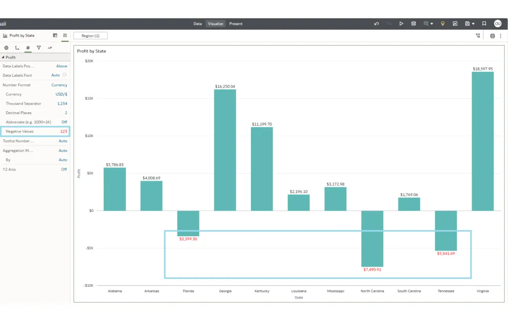
Using the steps described above, you can highlight negative numbers not only in visualisations, but also in tables and pivot tables:
3. Bind Parameters to Relative Time Filters
Recent updates introduced a feature known as Parameter Binding, highlighted in our blog posts about the July 2023 and November 2023 updates. With the latest release, this functionality is further enhanced, namely by its application to relative time filters. To leverage this feature, you first need to create a relative time filter. Then you’ll notice a new icon next to each value, enabling you to create a new parameter for these values or to choose an existing one:
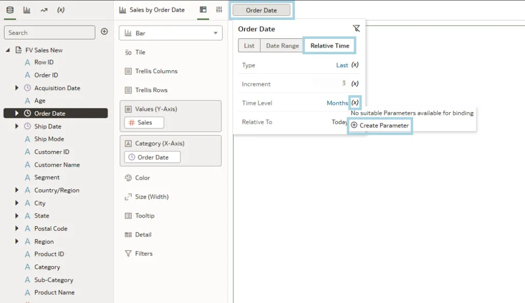
All the created parameters can be found in the left pane in the Parameters tab. From here, you can drag and drop them into the desired visualisation, providing a more intuitive and user-friendly experience:
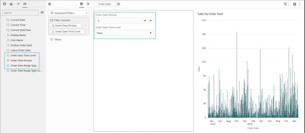
You can modify these parameters, restricting the range of selectable options within the filter to only those that are genuinely necessary. For instance, you could disable the capability to filter by days or exclude values greater than 12:
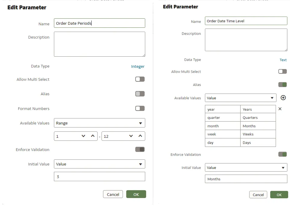
Besides relative time filters, this update also enables the binding of parameters to Top/Bottom N filters and reference lines.
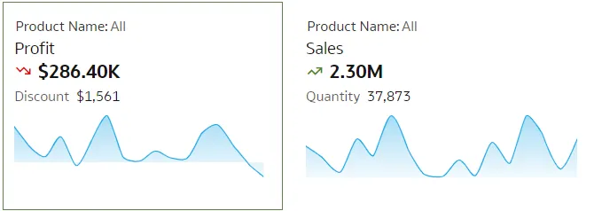
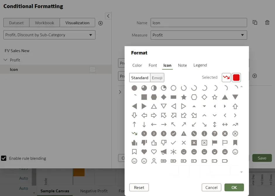
4. Add Emojis and Icons to More Visualisation Types
As we’ve already seen, significant enhancements have been introduced in this update, especially in the area of emoticons and icons. Expanding upon the previous updates, which limited their use to tables, the latest enhancement broadens their applicability across a wide range of visualisations. To use these emojis, you’ll need conditional formatting — a well-established feature that has been extensively discussed in various blog posts by our consultants: Conditional Formatting and Rule Blending and Conditional Formatting.
Emoticons and icons demonstrably improve the visual appeal and comprehensibility of represented data, as well as contributing to the overall user experience. Here’s a practical example of how to apply these enhancements effectively:
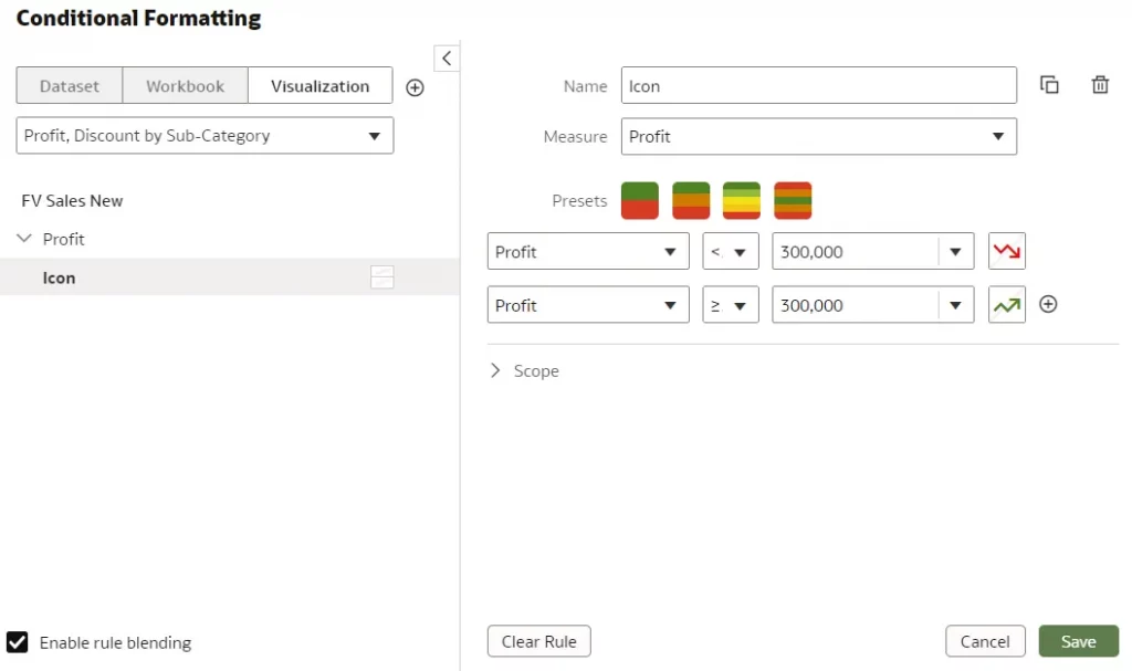
We have chosen a Tile visualisation to explain this feature. Our focus is on profit, setting conditions to apply icons through conditional formatting: one icon if the profit exceeds $300k and another if it falls below this threshold. In the conditional formatting settings, we select icons corresponding to these conditions. The image below shows how icons can be effectively used with conditional formatting in a Tile visualisation:
The condition has been set as follows:
Next, let’s check how emoticons, icons and colours can be selected, as illustrated in the image below:
5. Display Reference Lines in Attribute Columns
In our previous blog post on the Oracle January 2024 Release, we highlighted the significant benefits of reference lines for emphasising critical information. Until recently, their use was confined to time-based category columns, but the latest release extends this functionality to all column types, which is particularly useful when dealing with a wide array of column classifications. For instance, incorporating a reference line within the ‘Mode of Shipment’ column (Y‑axis) greatly facilitates the identification of specific shipping modes within the visualisation, providing an immediate, clearer understanding of the data on display:
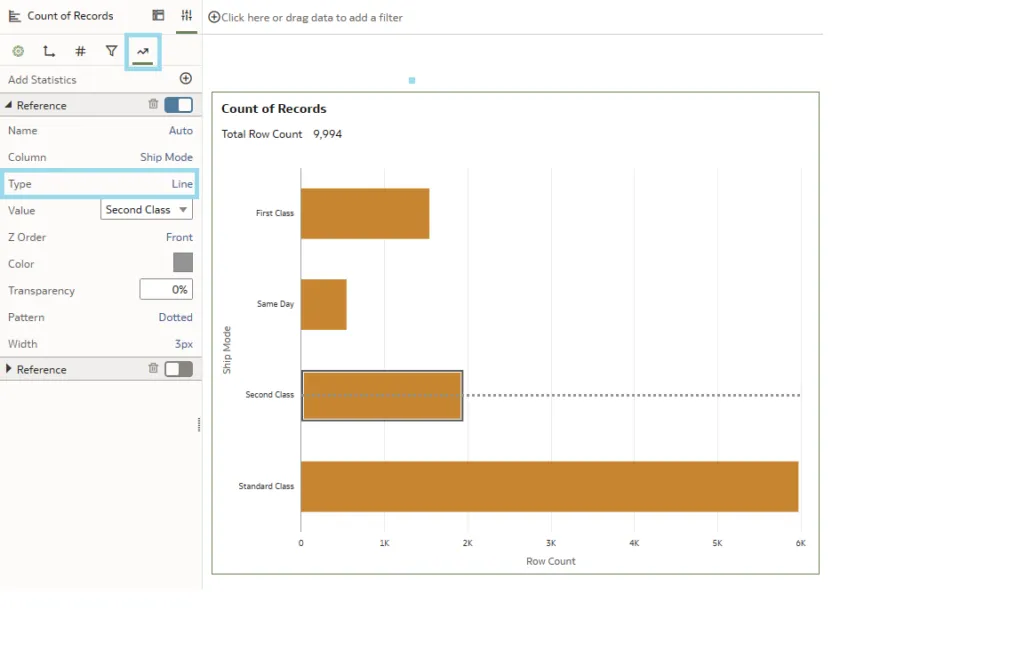
This approach enriches the user experience by offering a more intuitive understanding of the data. What’s more, with the enhancements introduced in the latest updates, you can now select either a singular reference line or a band for each line, as we can see below:
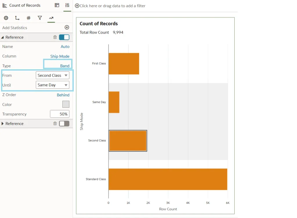
To add reference lines, you just need to hover over the visualisation and right-click. Various options will appear, and we need to select Add Statistics and Reference Lines.
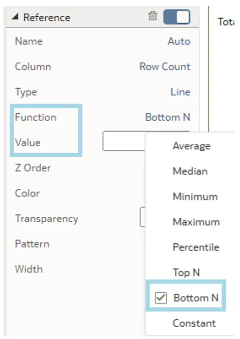
Another noteworthy update we’d like to highlight is the improvement in creating reference lines, particularly aimed at emphasising the Row Count. With this update, we now have access to an expanded selection of functions to choose from:
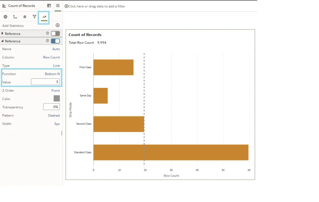
In the Properties panel, an option called Function has been introduced, offering a range of choices including the Top N and Bottom N options. These options allow you to set a reference line for the top or bottom N categories within the dataset; the Value option is used to specify the exact value of N. In our demonstration, selecting a value of 3 has highlighted the second class ship mode as the third category with the fewest records:
6. Persist Auto Insights Column Selection and Insight Types
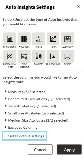
One of the latest advancements in Oracle Analytics Cloud is in the Auto Insights feature, specifically the persistence of column selections and insight types. This ensures that user settings are retained across sessions, facilitating an uninterrupted workflow even after workbooks have been closed and reopened. Previously, Auto Insights would reset user-defined options to default settings upon closing a workbook, meaning reconfiguration, but now, on returning to a workbook, users will find their previous selections and insight types preserved, streamlining the analysis process by eliminating the need for repetitive setups. This improvement saves time, allowing for more in-depth and productive data analysis.
Nevertheless, for those occasions when you want to start afresh to uncover new insights or to approach the data from a different perspective, resetting parameters to default settings remains an option, and this can be done by simply clicking on the Reset to default setting button:
Conclusions
Now that we’ve finished our review of the March 2024 enhancements to Oracle Analytics Cloud, it’s clear that even minor updates can significantly enhance user experience and productivity. Features such as the persistence of Auto Insights and the ability to easily reset to default settings demonstrate Oracle‘s commitment to providing users with intuitive data analysis tools, and whilst this update may not bring a multitude of new features, the advances presented in this blog post show their continuous effort to streamline workflows. Oracle Analytics Cloud, with these and future updates, still leads the way in setting benchmarks for modern data analytics platforms. Stay tuned for our next post, and don’t wait a moment longer to get in touch with our team of certified experts for solutions tailored to your specific needs!