Oracle Analytics Cloud – March 2023, Key Insights from The Spring Update
The second Oracle Analytics Cloud (OAC) release of the year is here (after the January update), and in this blog post we’ll bring you up to date with some of the new features that we’ve tested.
1. Conditional Formatting and Rule Blending
Conditional formatting was introduced in the July ‘21 release and synvert covered this feature in our OAS 6.4 blog post last year. Conditional formatting allows us to add different rules to our data visualisations in order to customise data or values in a different format, based on certain conditions (for example, Revenue > 10,000 USD).
But in this release, Oracle has added an enhancement to conditional formatting – the ability to blend rule styles: for example, allowing one rule to colour a cell, and another rule to make the font bold. Let’s look at some more examples and how to do it.
From the workbook, in the Visualize mode we go to the Menu icon (3 dots at the top right in the visualisation) and choose the option Conditional Formatting | Manage Rules.
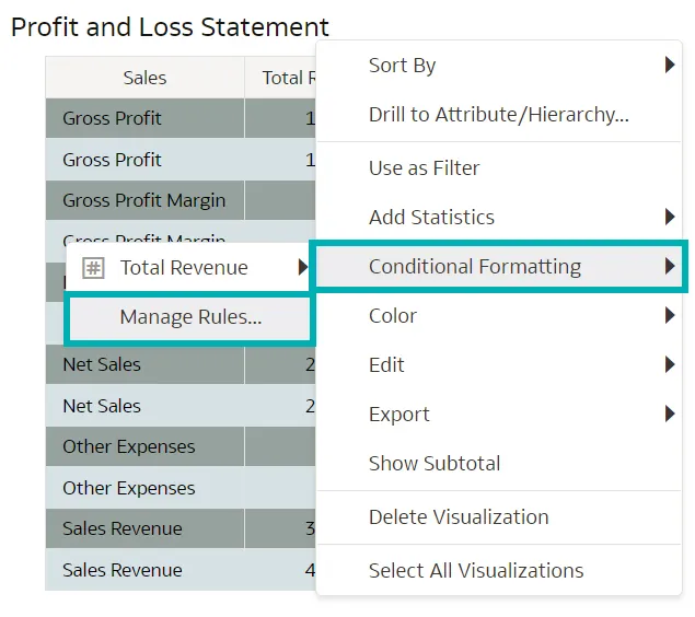
The Conditional Formatting tab will appear, where we can define multiple rules for formatting within the visualisation. This improvement enables us to visualise data in different ways by adding more formatting, and gives us the ability to create more than one rule and then select the one that suits our dashboard presentation the best.
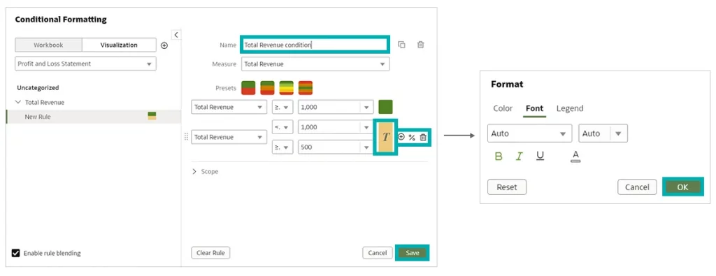
Now let’s implement this in a new example: imagine that we want to visualise revenues greater than or equal to 1,000 with the cell filled in green, and revenues between 500 and 1,000 filled in orange. This was, of course, already possible, but now we can add one more feature to blend the rules: we’ll put the orange measures in bold and italics as well, to make them stand out more because they need improvement.
To define the last characteristics, we select the + icon and the Format tab will appear, where we just have to select the customisation that best suits our visualisation.
Once the rules have been defined, click on Save and give it a meaningful name:
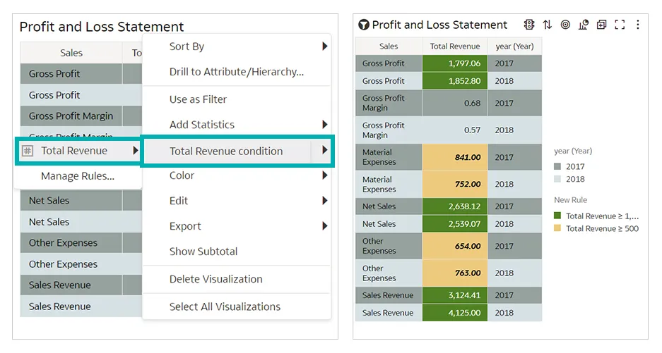
At this point it’s time to apply the condition formatting to our dashboard and see the result: simply right-click on the visualisation, select Condition Formatting, and we’ll see the ‘Total Revenue’ rule that we saved in the previous step:
2. Parameters
This update has also added a key tool for advanced users that are already accustomed to using Classic Analyses and Dashboards in OAC, namely the ability to create and employ fixed parameters almost anywhere.
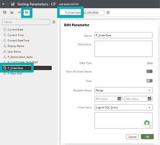
But what exactly is a parameter? In OAC a parameter is a reusable, user-defined, locally available measure or attribute that is based on a set of rules that we can configure for use in our workbook. As we can see in the screenshot below, they can be defined in the Parameters tab in a variety of ways, our favourite being a Logical SQL Query which gives plenty of room for creativity.
These parameters can be used in a variety of ways, and here we’ll look at those that have recently been added. The first example of parameter usage is when we’re generating a calculated field and can do the following:
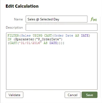
In this example, we have created a new sales measure that will be filtered based on the date specified in the parameter.
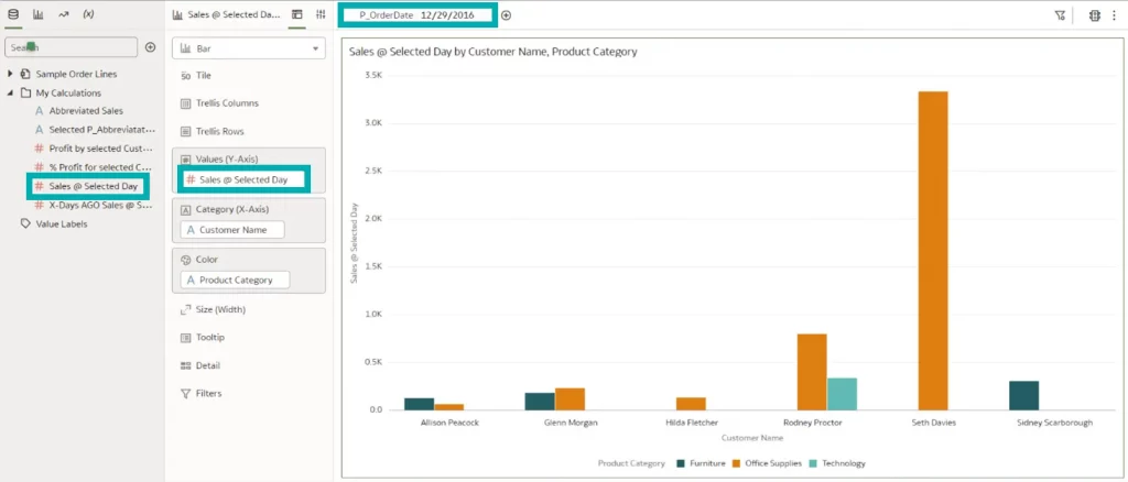
Once the measure has been configured as a calculated field, we can use the parameter filter expression on our visualisation, offering us new ways to display data in OAC, as seen below:
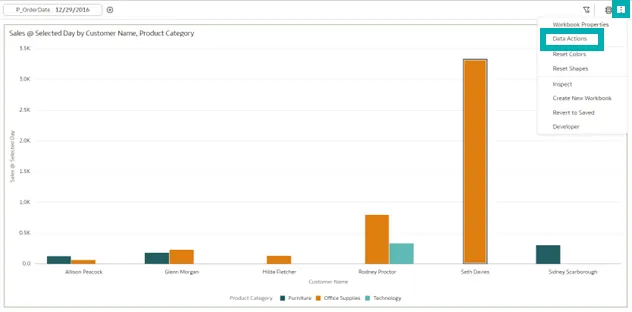
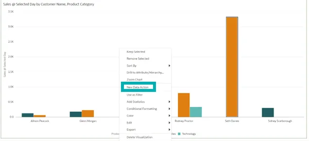
Now let’s run through parameters on data actions, which we can configure in the following menu:
The two most common uses of data actions are analytics links and URL navigation. Now we can use parameters on them, opening up a whole world of possibilities. Once generated, we can use them on our dashboards:
Parameter use in visualisations is a very powerful feature, often used in Classic Analyses and Dashboards, so it’s bound to be welcomed by all advanced users!
3. Show or Hide the Filter Bar on Dashboards
Oracle has always allowed us to apply the filters we need to a dashboard page, or to apply them directly to a visualisation during its creation, but the filters were always visible in the Present Panel.
Now, with this new release, we can hide those filters so our final visualisation looks even better!
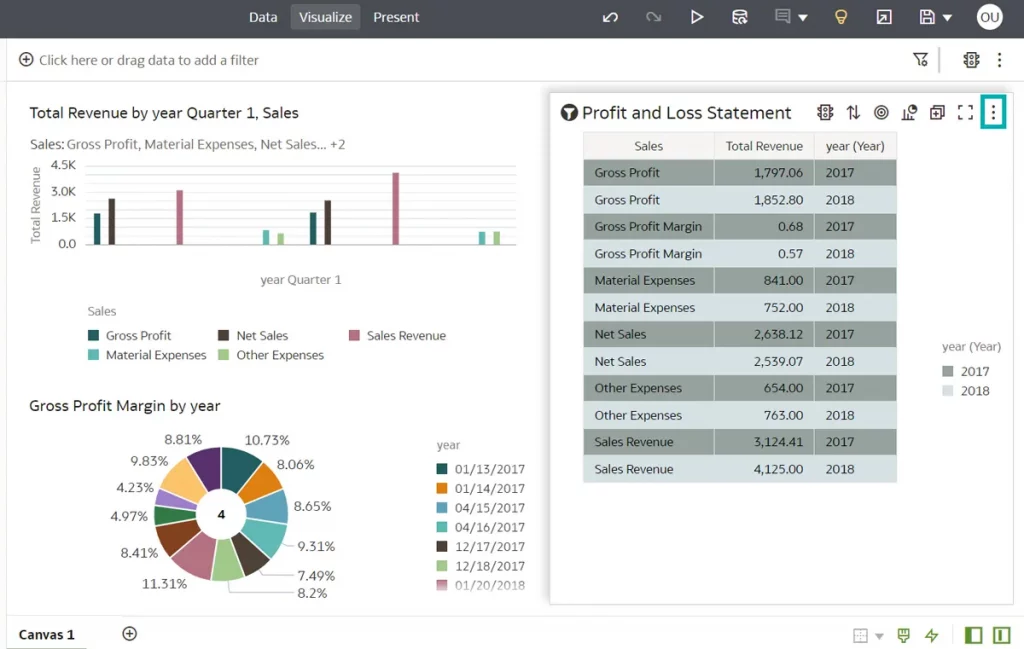
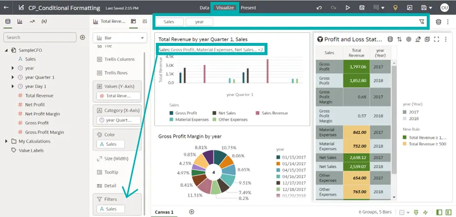
To implement this new feature, let’s open a workbook that contains a filter visualisation. In the following image, there is a filter at the top of the dashboard page and another for the ‘Total Revenue by year Quarter 1, Sales’ dashboard.
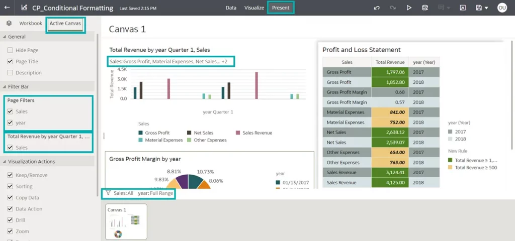
Navigate to the Present mode and add the canvas to the story, where we can see both the filters in the presentation. If we look in the Present mode we’ll see that there are two new tabs along with the canvases which were missing from the previous version of OAC (Workbook & Active Canvas).
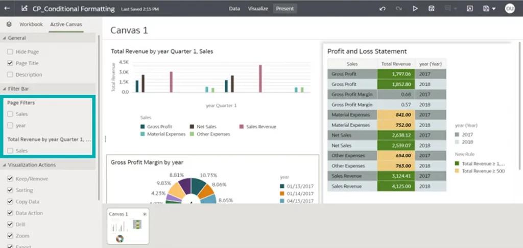
Click on the Active Canvas tab and we can see a list of contents containing all the information embedded in that canvas (for example, page title, types of visualisation, filter bar, etc.). From the Filter Bar section, select or deselect the contents to show or hide a filter bar in the dashboard:
Conclusion
Oracle has released the second update of 2023 with several new features, enhancements, and fixes that improve the overall OAC user experience.
Take a look at the new features and start using them to get a better presentation of your dashboards by applying the necessary format changes to your data, and get more space for your visualisations by hiding the filter bar.
We haven’t covered all the new features here, but we shouldn’t forget the time filter for deliveries (quickly see your most recent deliveries and get an idea of delivery evolution over the past week), nor how easy it is to sign a PDF report by just choosing the digital signature registered at the Publisher instance. We can see that OAC is going in the right direction, updating features that help users to get the job done stylishly.
In the meantime, if you want to see how Oracle can bring even more value to your business, just get in touch with our certified, experienced consultants!