Oracle Analytics Cloud – Highlights from the January 2023 Update
There is no better way to start the new year than with a new Oracle Cloud release. January has brought us a bunch of new features. We have tested and analysed some of them, and here is an overview of those that we found the most interesting.
1. Improved Home Page
In January 2023, Oracle improved Home page navigation by redesigning it and making it more customisable. Let’s look at the differences between the old and the new versions.
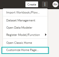
To customise the Home page, click Page Menu, then Customize Home Page:
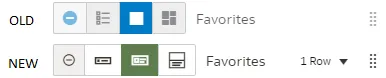
In earlier editions, there was already the option to change how content was displayed; we could select from Hidden, Tiny, Standard, and Mosaic. Now we can select between a Hidden, Small, Medium, or Large display option when we hover over a category icon. Below we can see the difference between the old and new display content possibilities:
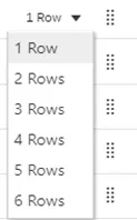
What’s also new is the possibility to specify how many rows we want to show for each category. Click on Row, then choose an option from the list (up to six rows of content per category):
By clicking on the handle next to the category and dragging it to a new position, we can change the order of content categories such as What’s New, Favorites, Workbooks, Dashboards and Reports, Datasets, and others.
We can also open editors in a new tab, by selecting Open Editors in New Tabs.
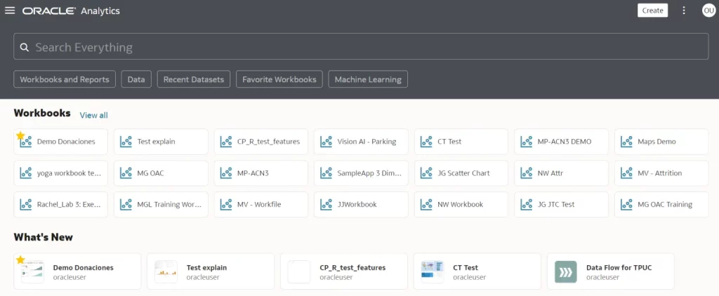
Let’s go through a small illustration of how it works: we arranged our content categories and placed the Workbooks content category at the top of our Oracle Analytics Home page, selected the Small display option with 3 Rows. As you can see in the picture below, the Workbooks content category is now displayed as three rows of different items:
2. Improved Experience for the Grammar and Property Panels
Oracle has rolled out a new experience for the Property panel. Previously, when we clicked on the visualisation, the Property panel was below the Data panel. You often had to expand the Property panel, thus hiding the columns in the Data panel, impacting the user experience:
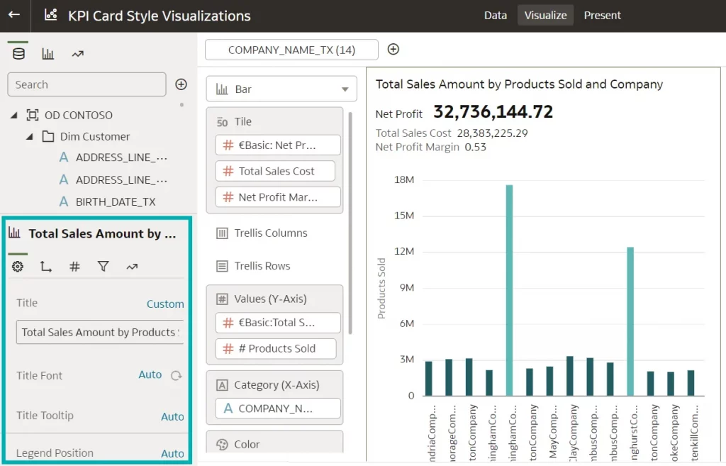
In the new update, Oracle has moved the Property panel from below the Data panel to the area next to the Grammar panel. This enables us to see the Data panel and to toggle between the Grammar and the Property panels while building the content, as you can see in the image below:
You can now enjoy an improved user experience because you no longer need to hide the Data panel columns to see the list of properties. The properties that we see in the new layout are the same as they were before the update.
3. Improved Tile Visualisation
In the previous version, we could only add one measure to a tile. The new version allows us to add one or more measures to a tile visualisation and to specify the layout and positioning of labels and values for the primary measure and multiple secondary measures. Additionally, conditional formatting rules can be applied to both the primary and secondary measures.
Several measures in a tile visualisation can come in handy when we want to display measures related to each other, without having to create each measure as a separate tile, thus overcrowding the dashboard. Let’s imagine that we are building a financial dashboard where we have targets and actuals. Before this update, if we wanted to show the actual number, the target, and how close we are to reaching it, we would have to create 3 tiles. With the new tile, we are able to display all 3 measures in one tile in a nice, organised way.
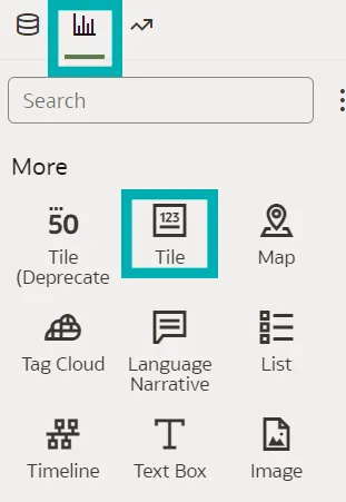
In the Visualizations panel, in the More section, we can see a new Tile visualisation, next to the previous version which is marked as deprecated and will most likely be removed in future releases:
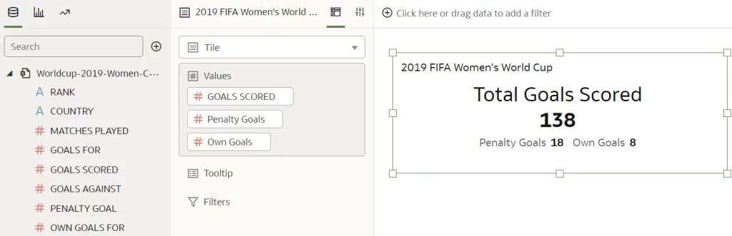
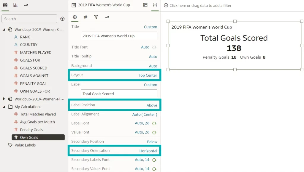
In the examples below, we will demonstrate the new tile visualisation capabilities. We’ve taken data from the 2019 FIFA Women’s World Cup with total goals scored as the primary measure and total penalty goals and total own goals as secondary measures:
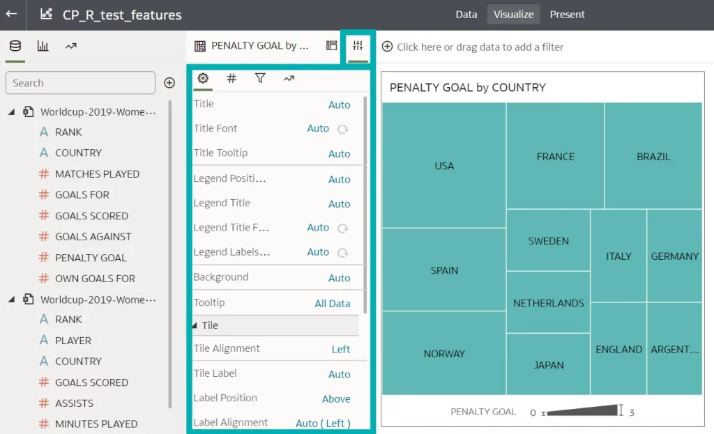
In the Properties panel of the tile visualisation, there are several properties that you can apply to the primary and secondary measures, like their positions, label position, orientation of the secondary measures, and so on:
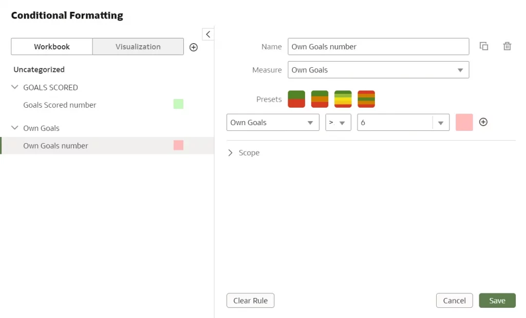
Based on our needs and reporting requirements, we can conditionally format our data in the Conditional Formatting dialog. For example, we added two rules to our tile visualisation, one for own goals (if the number of own goals scored in the World Cup is more than 6, format the tile in red) and one for total goals scored (if the number of total goals scored in the World Cup is higher than 120, format the tile in green):
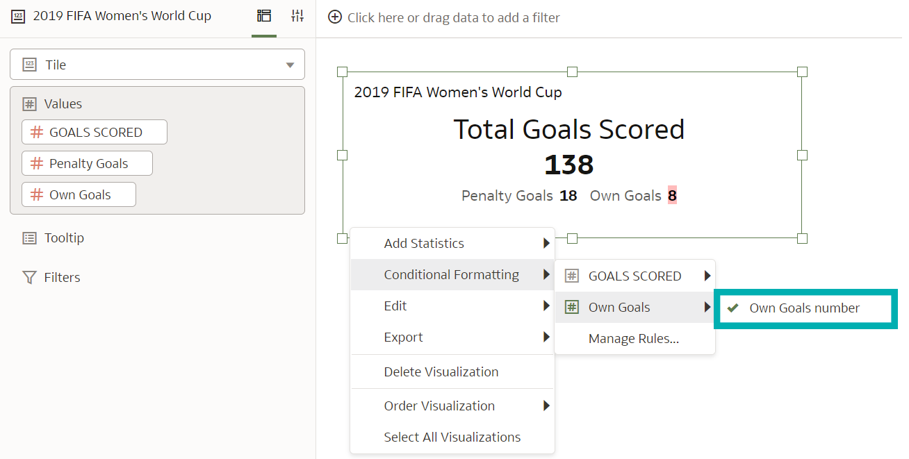
When we turn on the rules, we see how they behave depending on whether a measure is primary or secondary.
If a tile has conditional formatting set on a primary measure, the rule affects the entire tile’s background colour. When conditional formatting is set on a secondary measure, only the background colour of the value is changed, regardless of whether the primary measure has conditional formatting set or not.
In the example below, we will first apply a conditional rule to the secondary measure, total own goals. Even if there is no other conditional formatting applied, the background colour is applied only to the value itself:
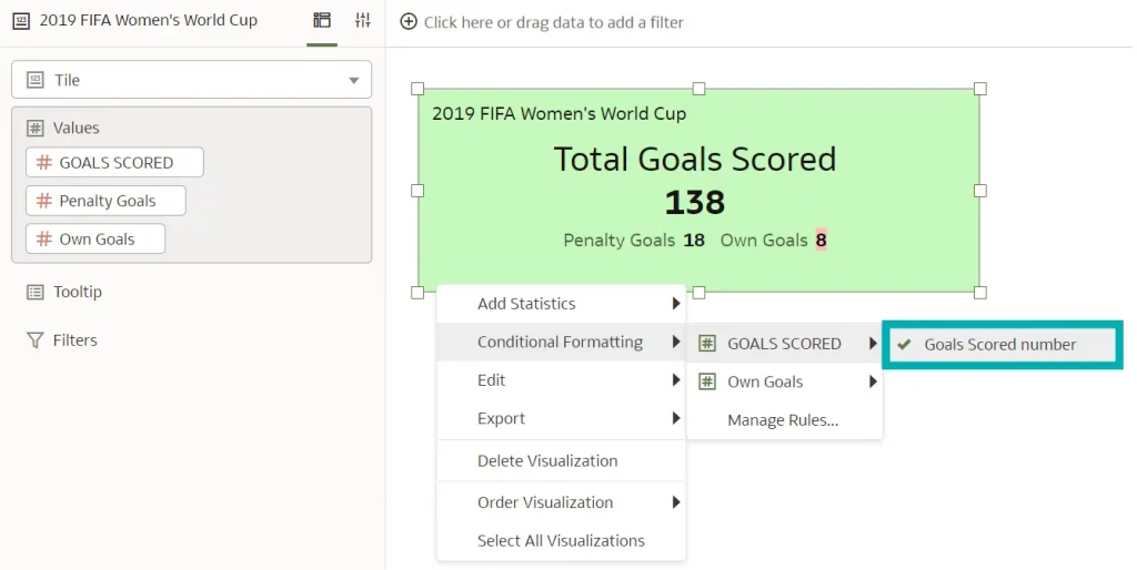
Next, we will apply a conditional rule to the primary measure, total goals scored. When a rule is applied to a primary measure, the whole tile background colour is changed:
Although Oracle offers many formatting options, conditional formatting still has room for improvement: it would be nice to be able to apply more conditional formatting options other than just changing the background colour, as the design feels a bit limited. Nevertheless, it’s a step in the right direction, and hopefully more options will be available in the future.
4. Automatically Calculate Time Durations such as Year, Month, and Day
In this example we are going to show how to easily calculate time durations such as year, month, and day in our datasets with semantic recommendations in the Oracle Analytics Dataset Editor.
This feature compares the value of our date column to the system date and can therefore be very useful in many scenarios, calculating things like age, employee tenure, time remaining on a contract, to name but a few.
In our example, we are going to to evaluate this feature by uploading an accountinfo_sales.xlsx document provided by Oracle. First, we click on Create Dataset and select the option to upload it from our computer. We can see the uploaded file in the image below:
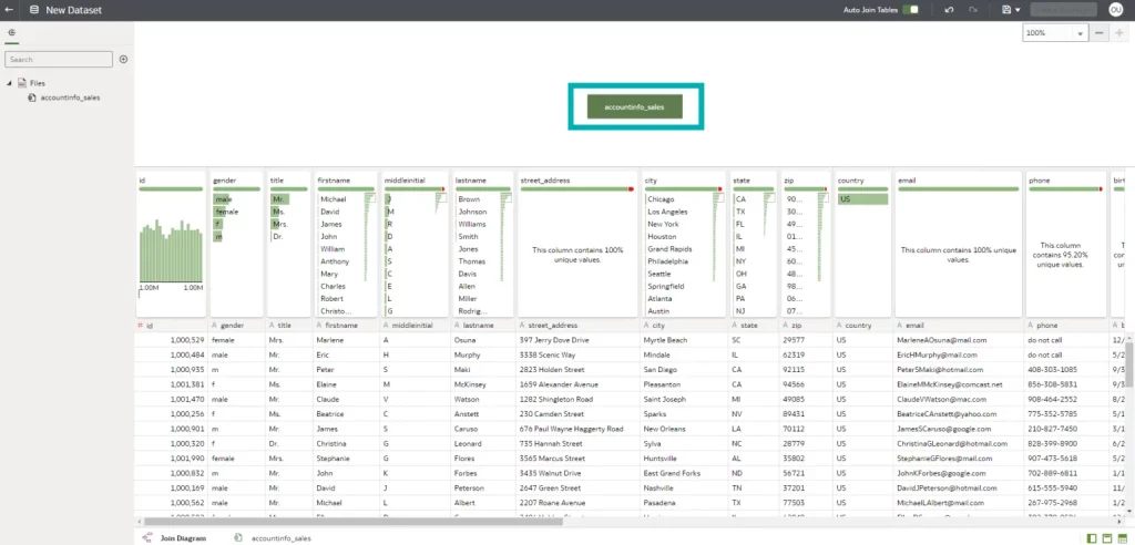
We then double-click on the green box displaying the name of the file to enter the Preparation Script mode, where we can see the Recommendations panel on the right where the profiler automatically detects the column data types and adds best practice recommendations:
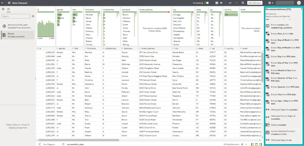
Our file contains account information of various data types, but for this example, we will focus on the Date fields.
When we click on each field, a set of recommendations is generated based on the properties of the data, so in our case, clicking on the date fields offers a recommendation for extracting parts of the date, like the year, month, day of the week, etc.
At the bottom of Recommendations there are also some recommendations to extract time intervals in different measures, such as year, month, and day:
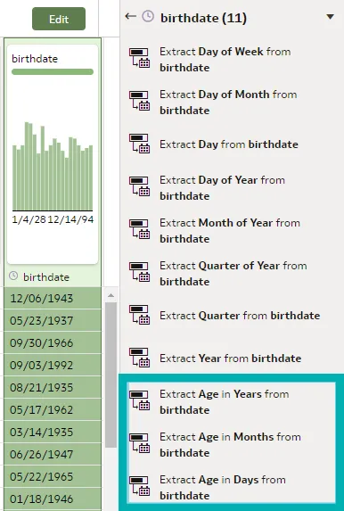
By accepting one of these recommendations, we will be creating a formula which can be edited, that will dynamically calculate the durations based on the current date. For example, to calculate how old the users are, we click on the Extract Age in Years from birthdate recommendation. A new column is created:
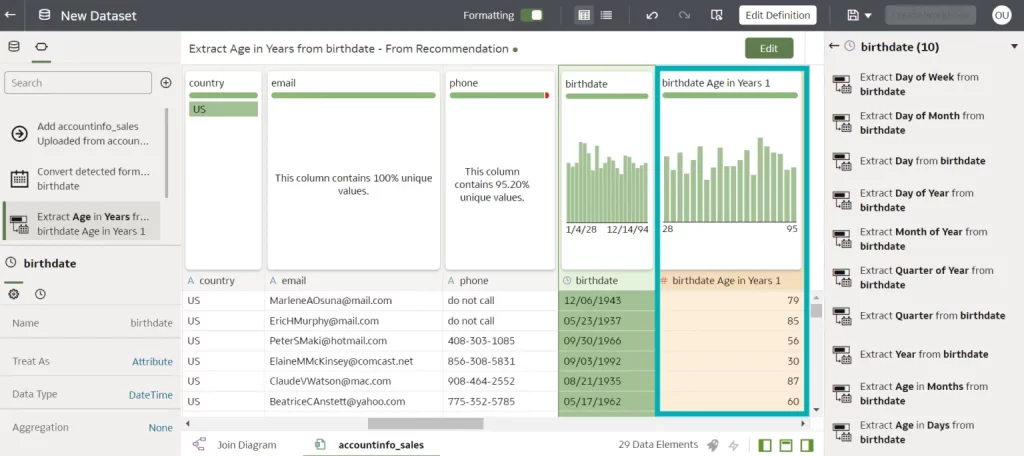
We can also view the formula that was created for us, and edit it if necessary:
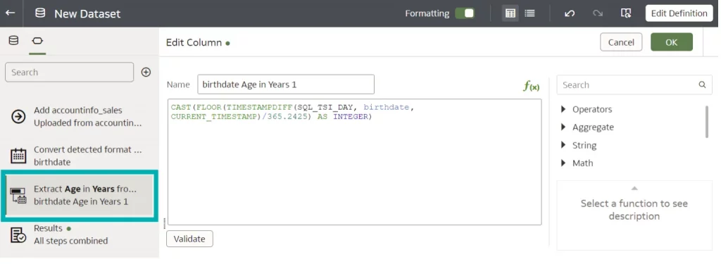
Since these calculations are based on the current date, they are dynamic and their values will automatically change.
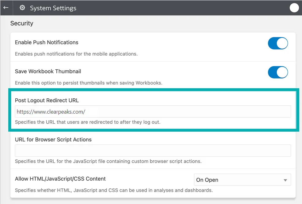
5. Post Logout Redirect
A new Post Logout Redirect URL security option is available on the System Settings page, allowing administrators to select the URL to which users will be redirected when they log out of Oracle Analytics Cloud. For instance, we might want to display sign-in information that opens the classic Home page, or re-route users to a company website:
The Oracle Analytics Cloud instance does not need to be restarted to change this setting, but if the instance was created before January 23, 2023, a service request with Oracle Support will need to be created for it to take effect.
Conclusion
Oracle has released the first update of 2023 with several new features, enhancements, and fixes that improve the overall OAC user experience.
Take advantage of the personalisation options and navigate the newly redesigned Home page with ease. In all Workbooks, the Properties panel is now located next to the Grammar panel for simpler navigation. Updated tile visualisation allows us to add metrics and it also provides the layout and positioning of labels and values for primary and secondary measures.
Automatic calculation of time duration by comparing the system date with years, months, and days is a great addition to the semantic recommendations in the Oracle Analytics Dataset Editor, and to complete the user experience, they have added the ability to redirect users to a specific web page when they log out of Oracle Analytics Cloud.
In the meantime, if you want to see how Oracle can bring even more value to your business, just get in touch with our certified and experienced consultants!